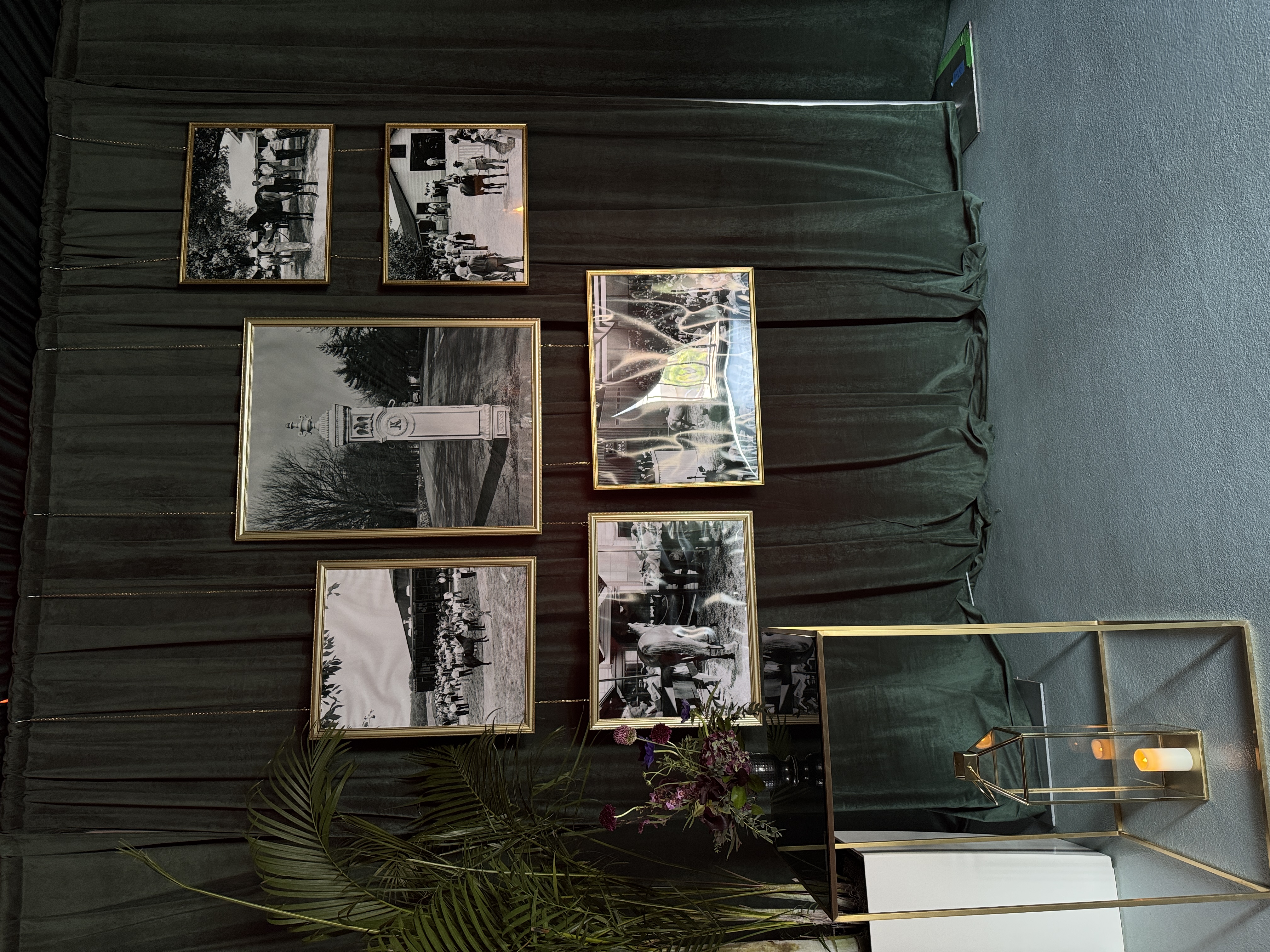
Breeders’ Cup
Art Direction – Experiential Marketing2025
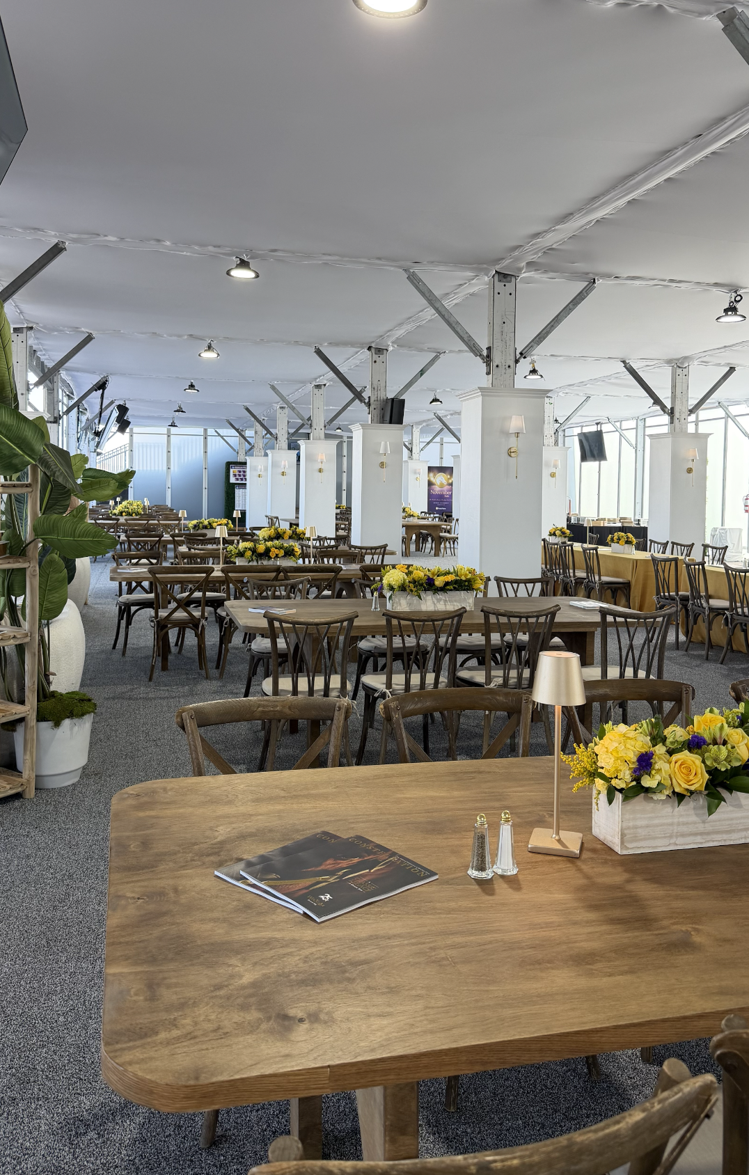
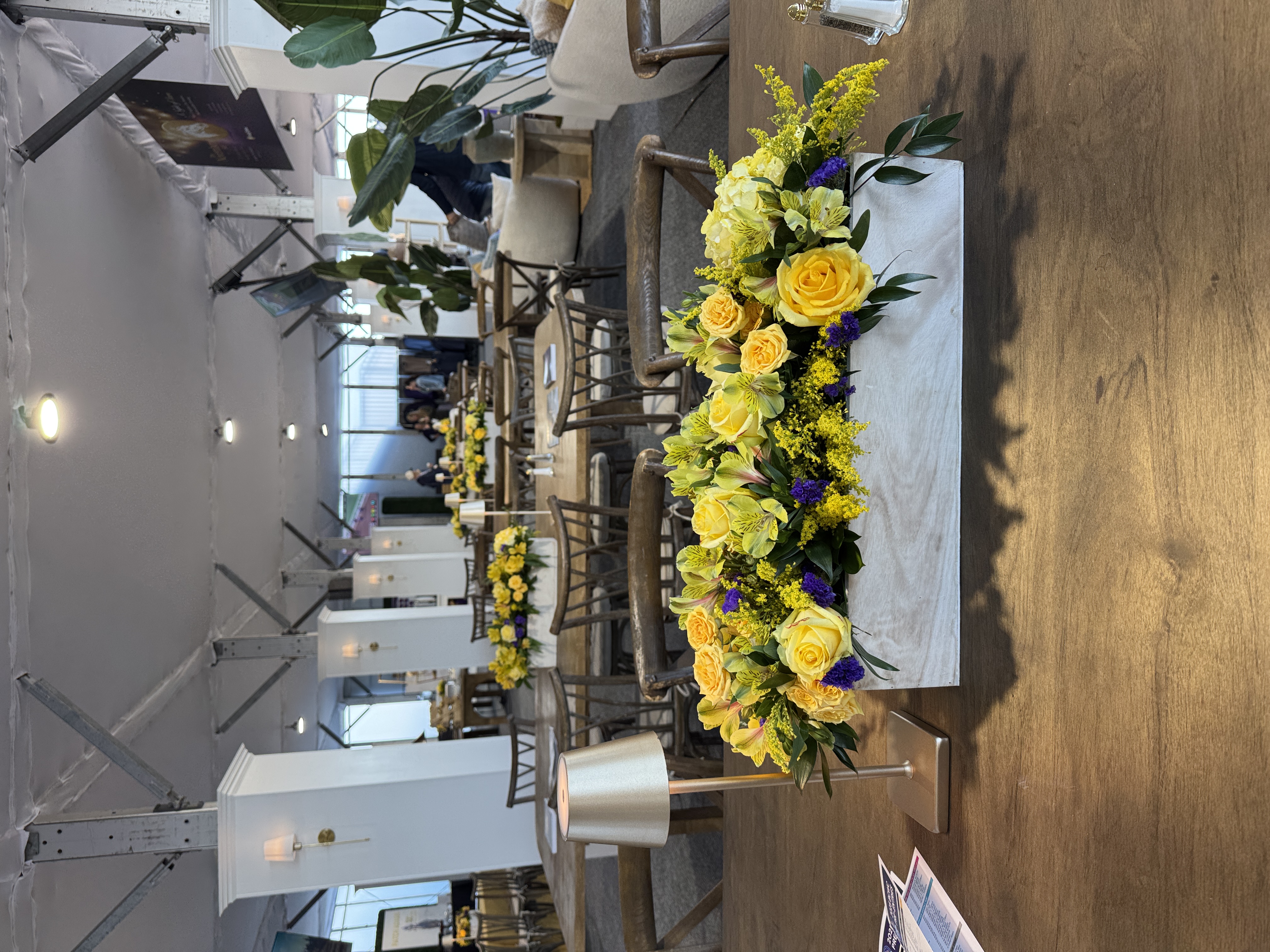
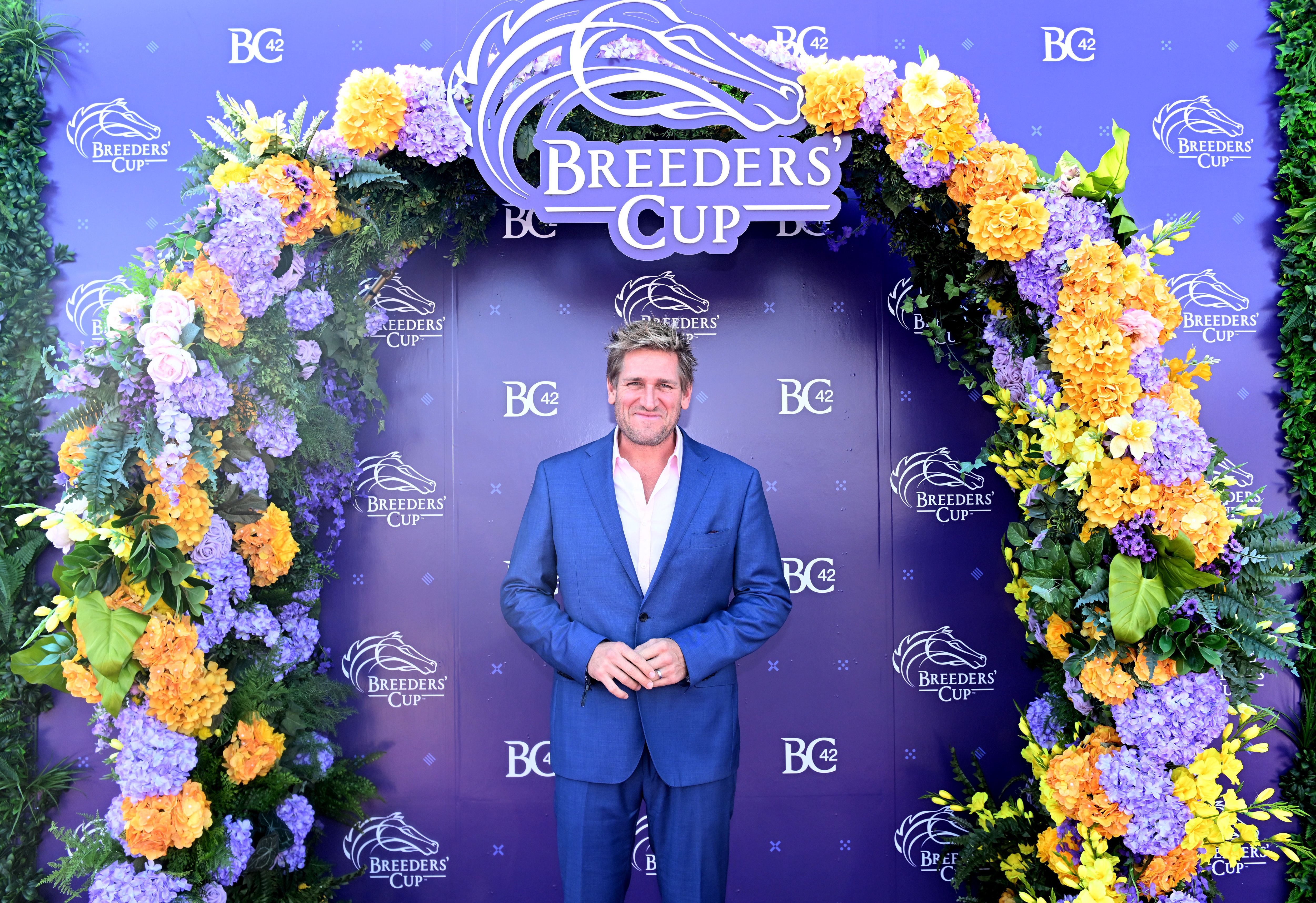
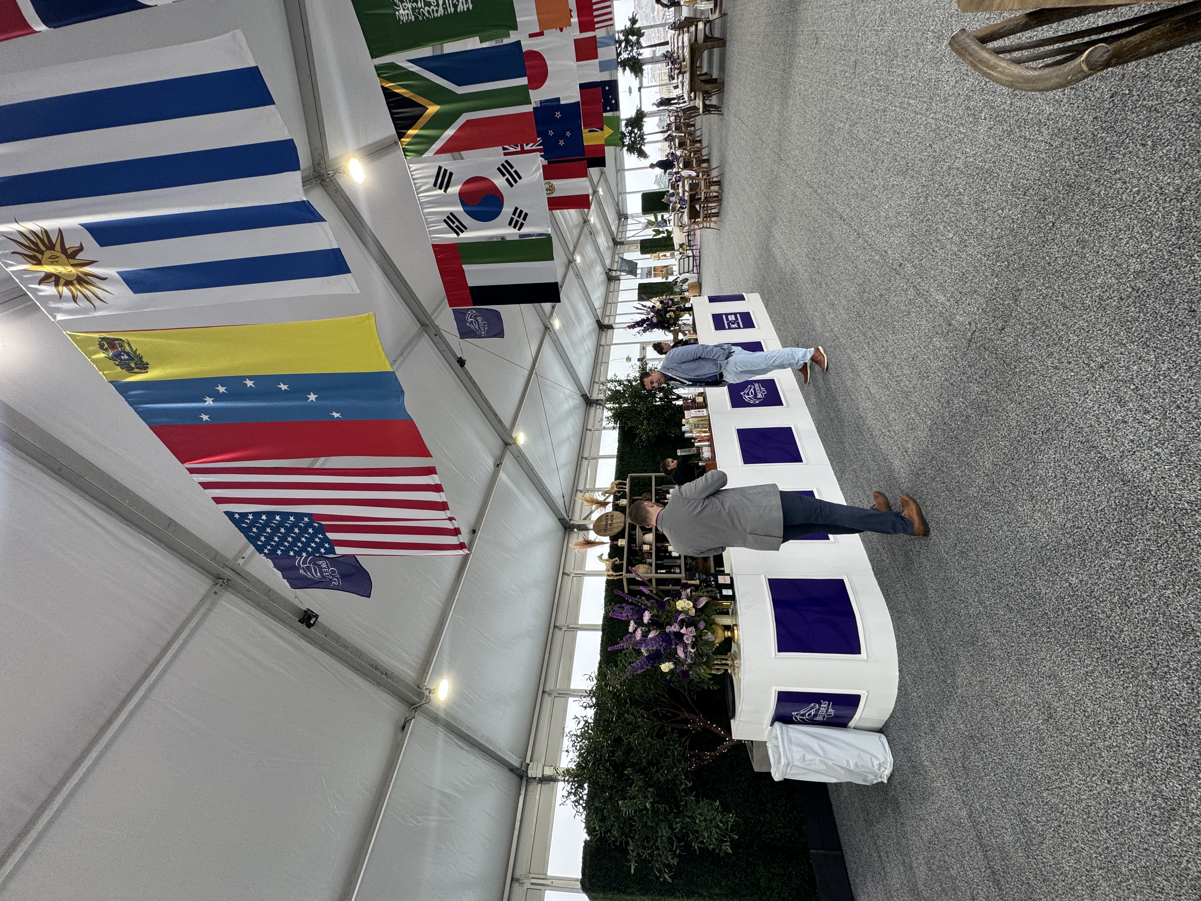
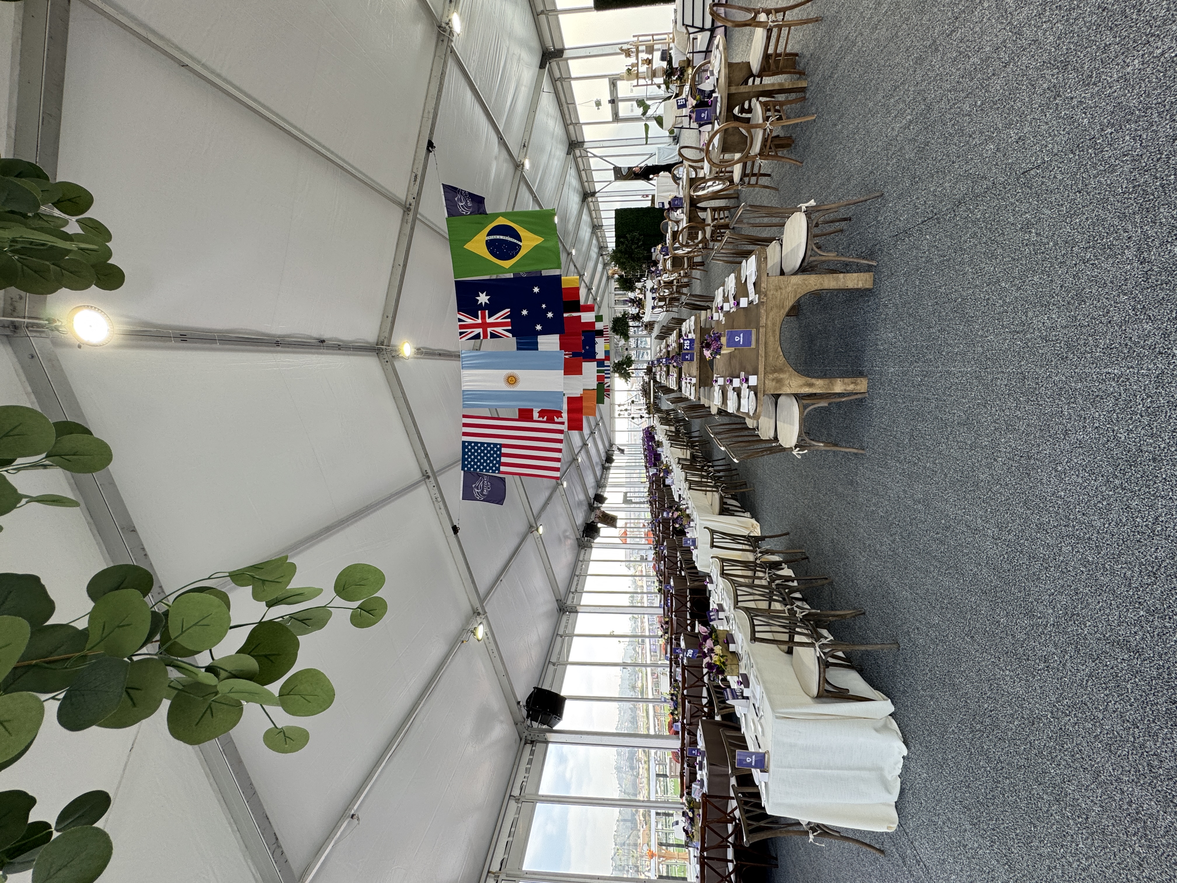
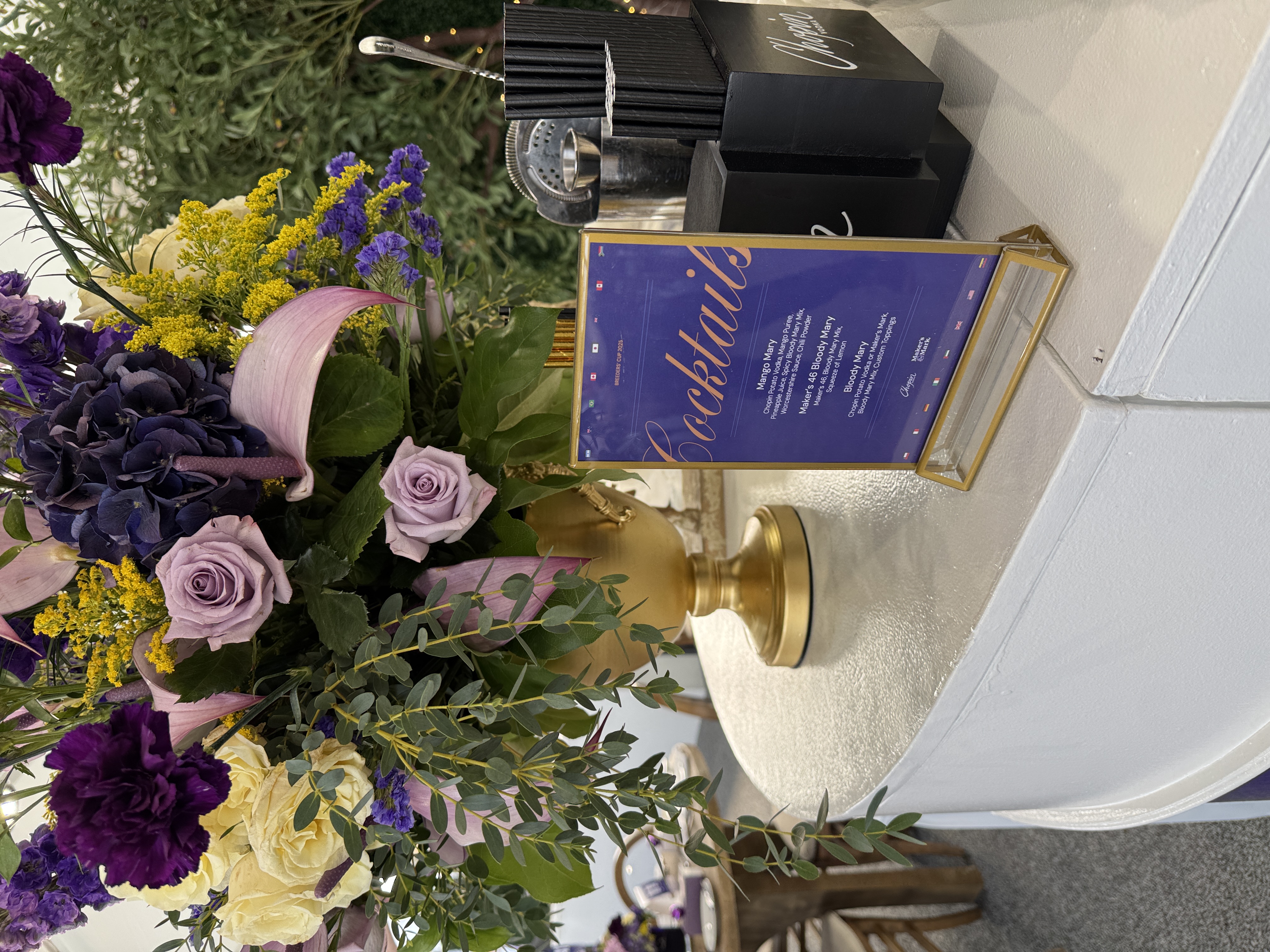
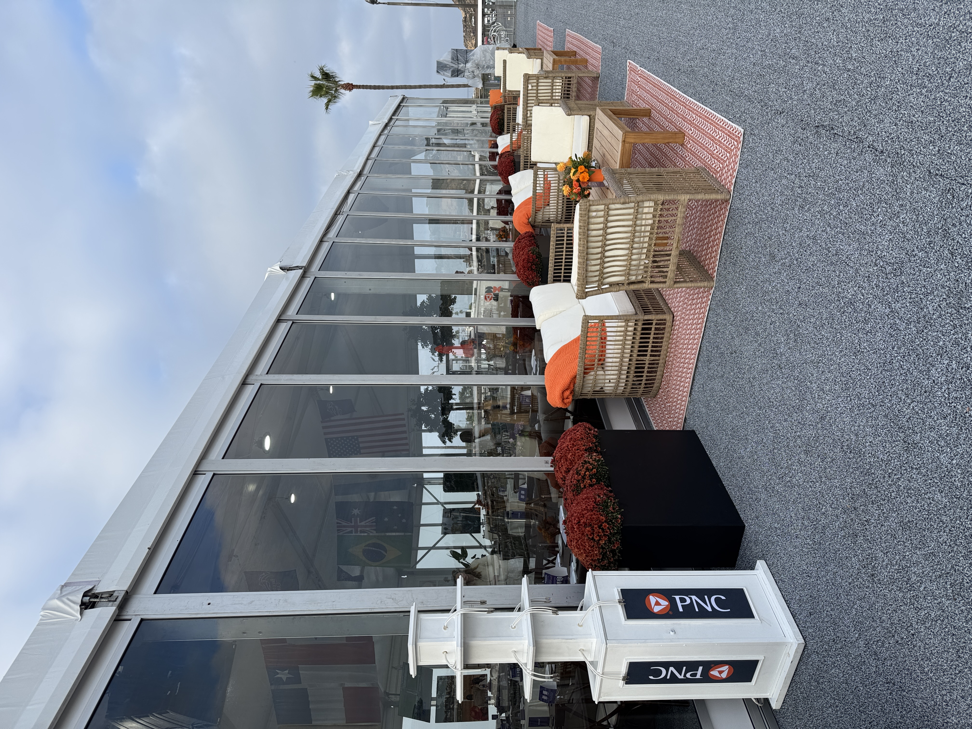
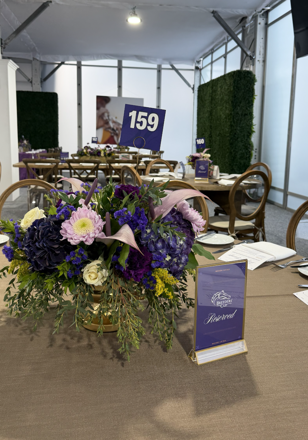
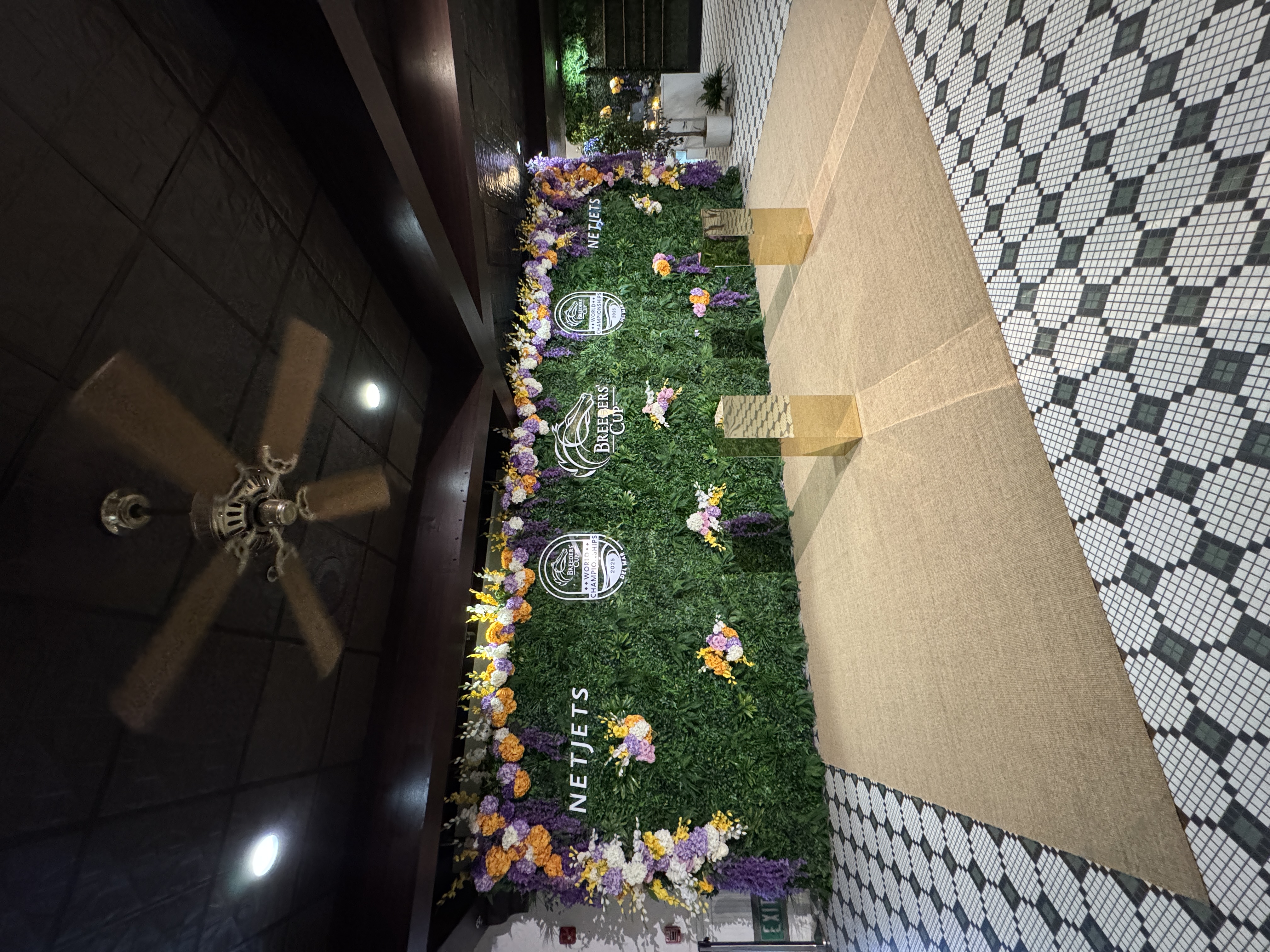
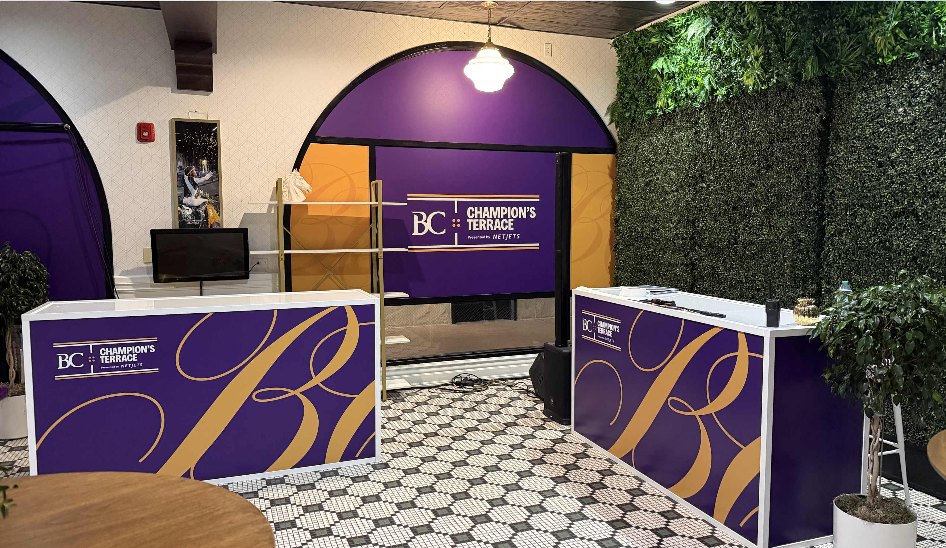
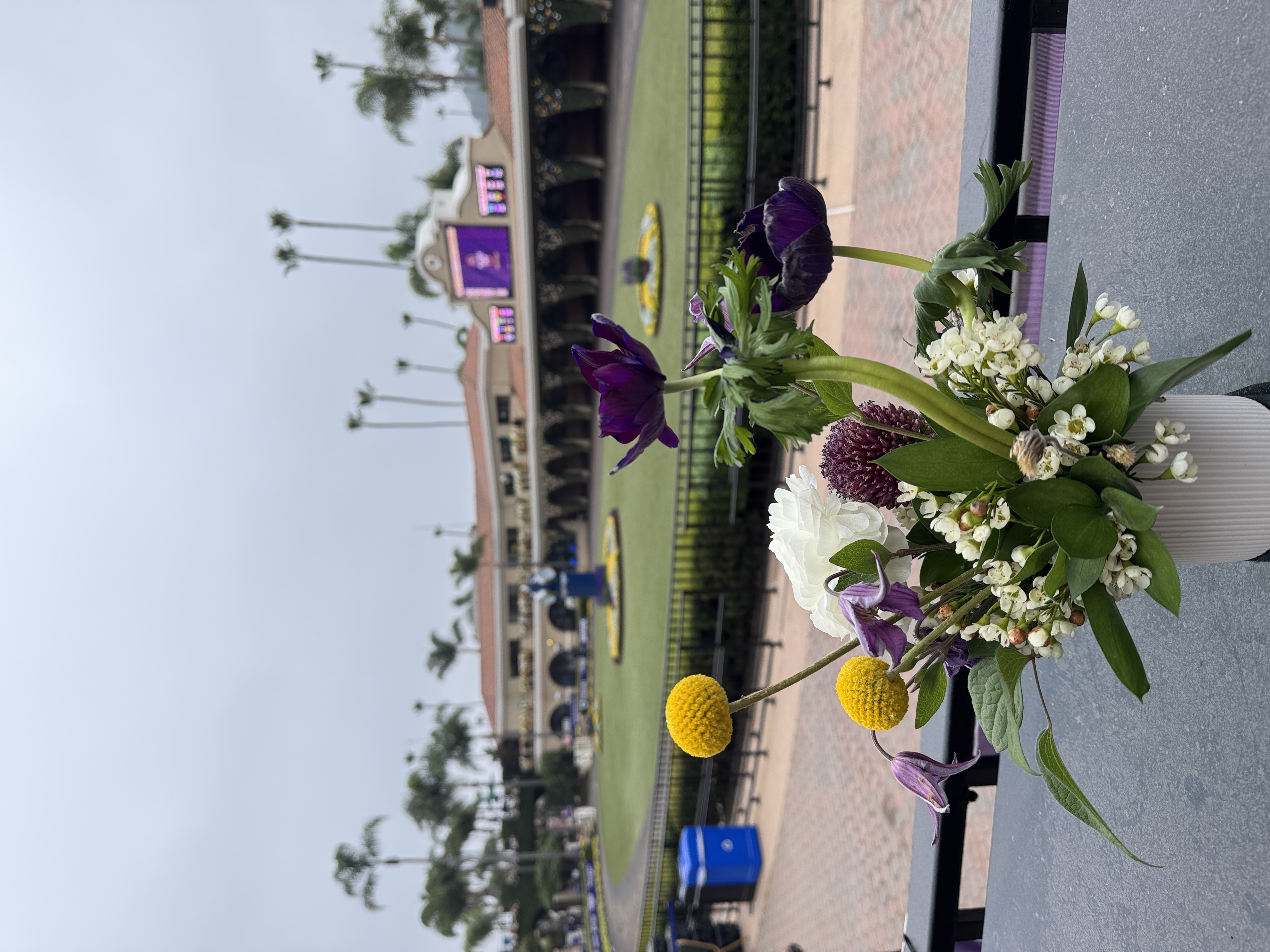
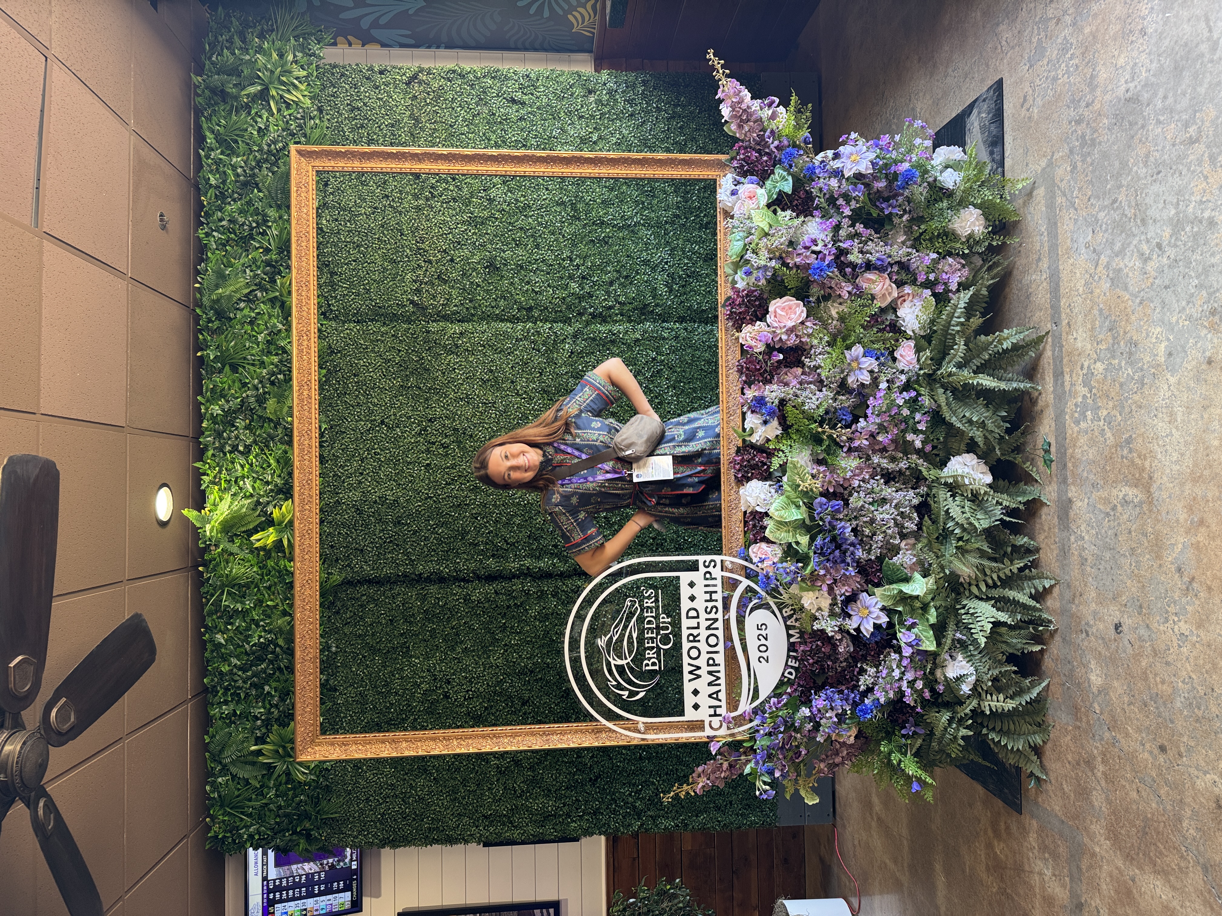
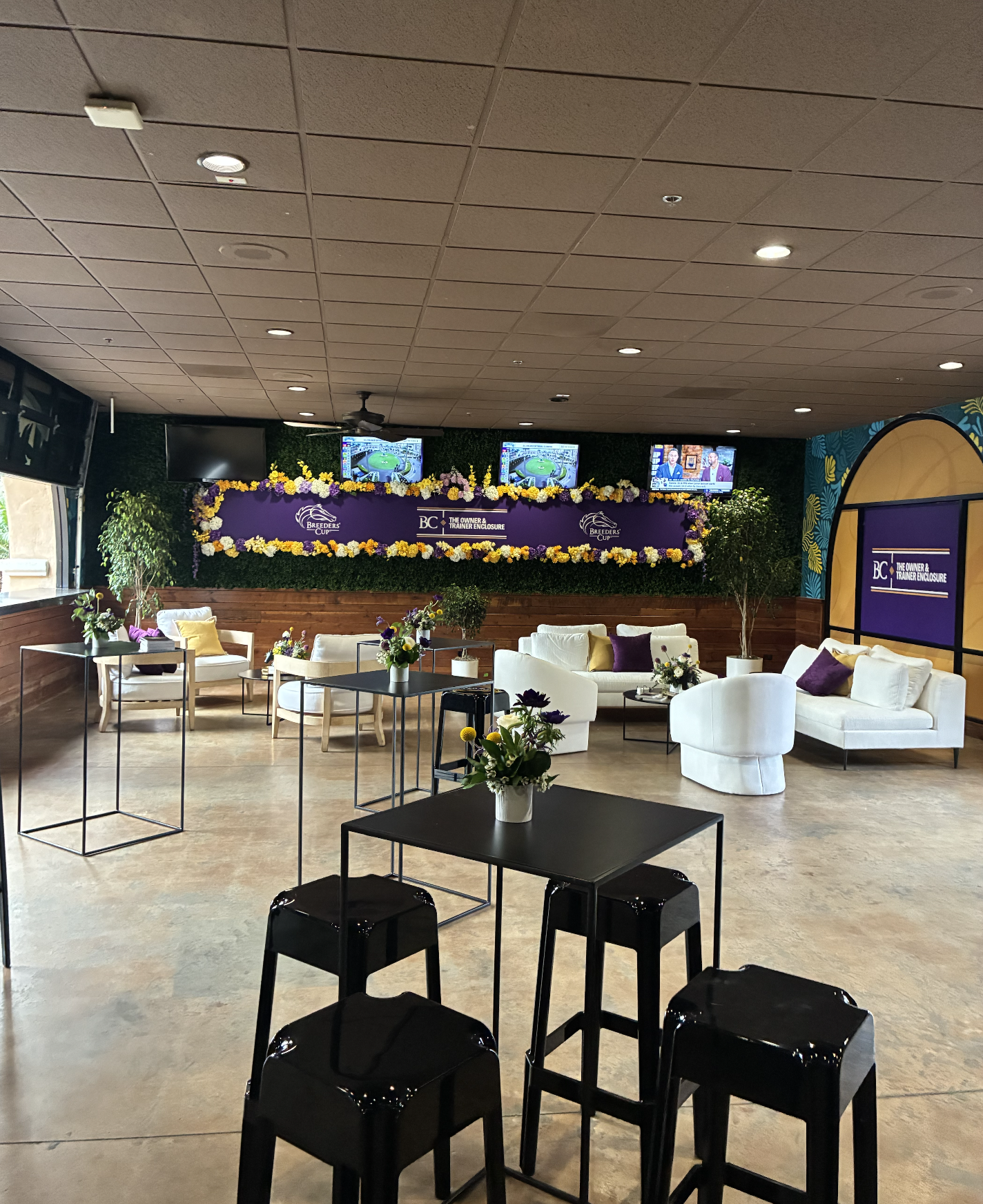
Breeders’ Cup 2025 in Del Mar, California featured all-new branding (by 160over90) in over 8 locations on the racetrack, including a two-tier structure, a speakeasy, and VIP spaces. Each space had a distinct look-and-feel, complete with curated rental furniture, signage, photo opportunities, and thoughtful branding moments. An on-site team of nearly 15 160over90 employees, myself included, executed the racetrack and off-site activation during race week.
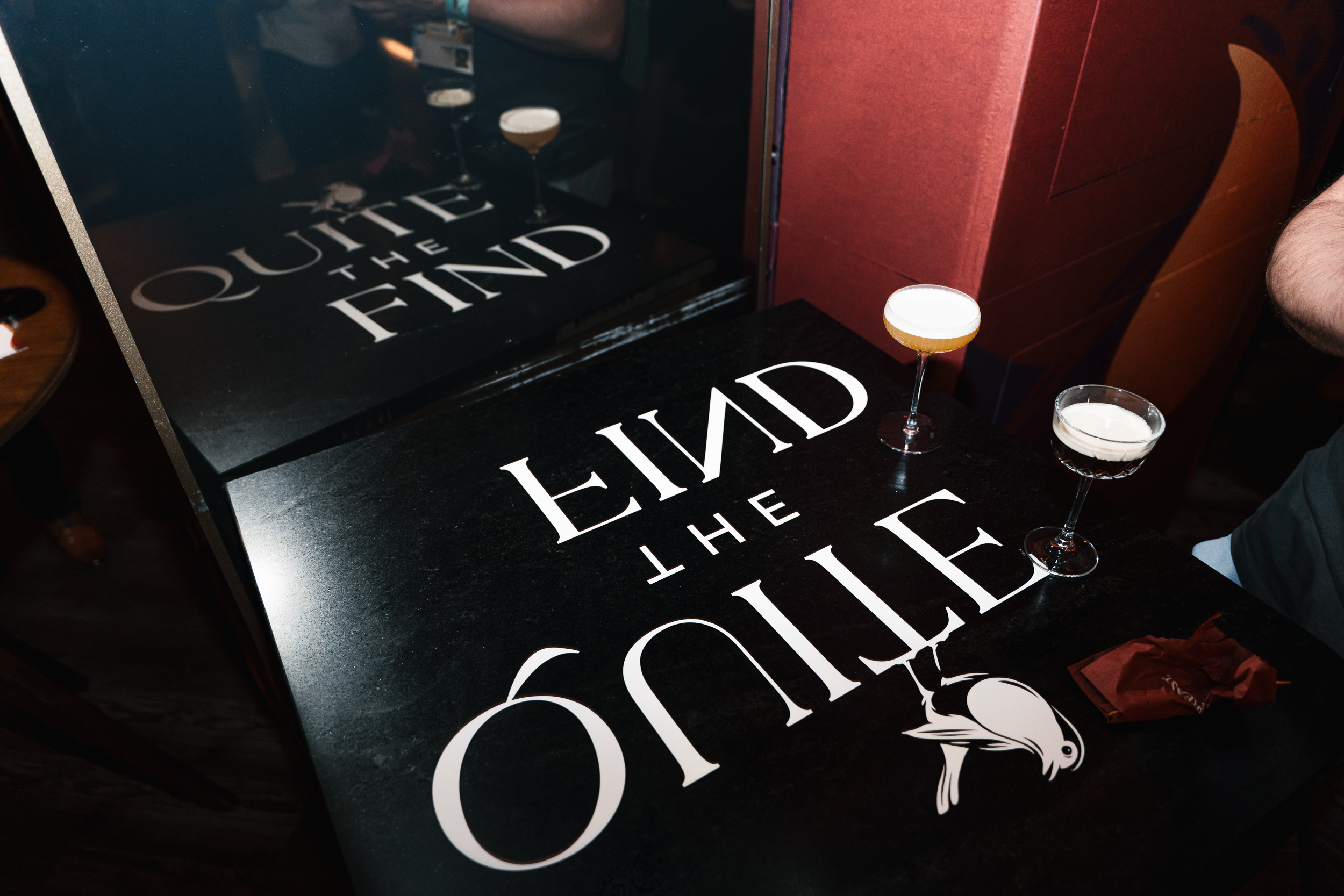
Trophy Lounge
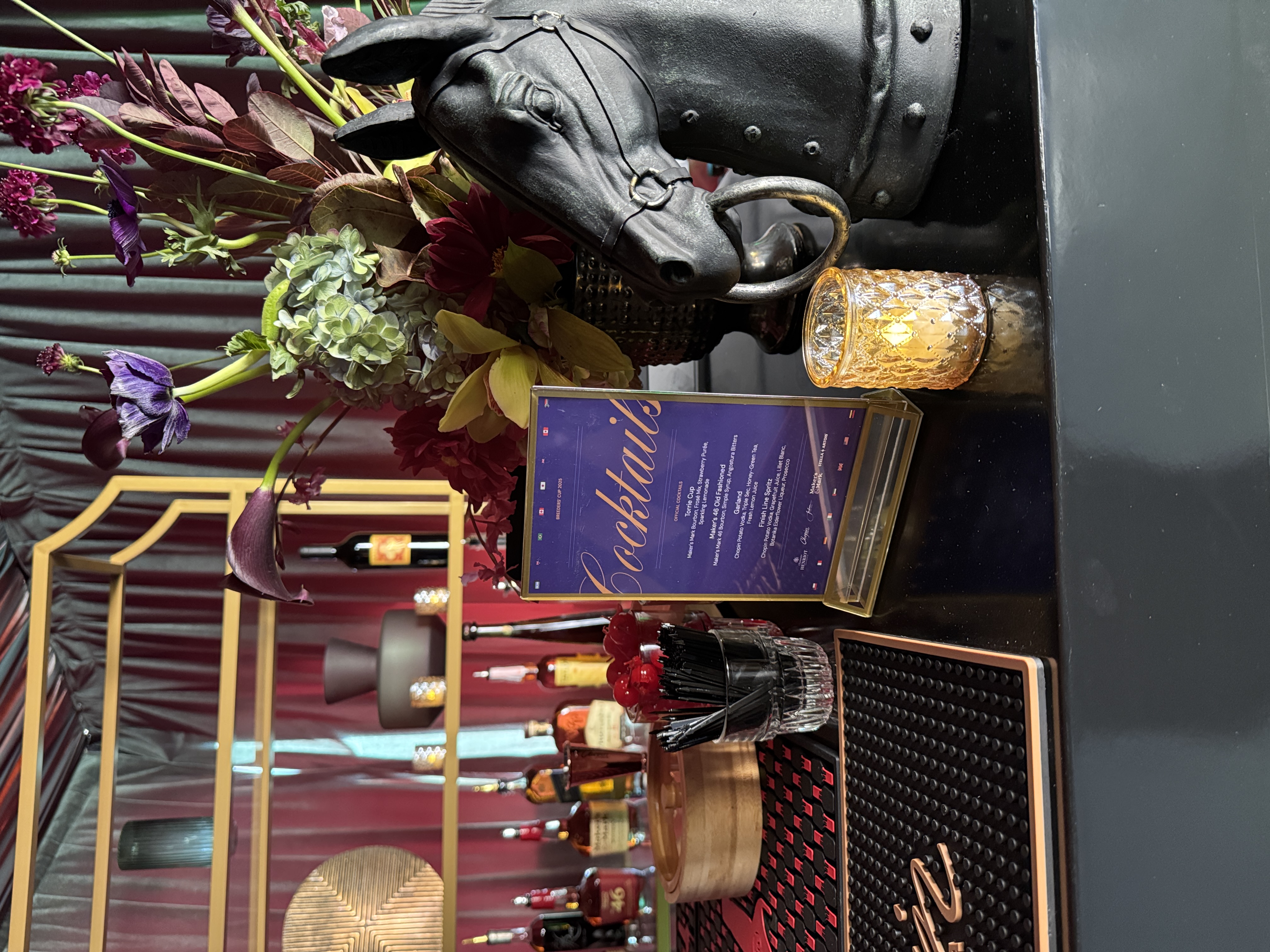
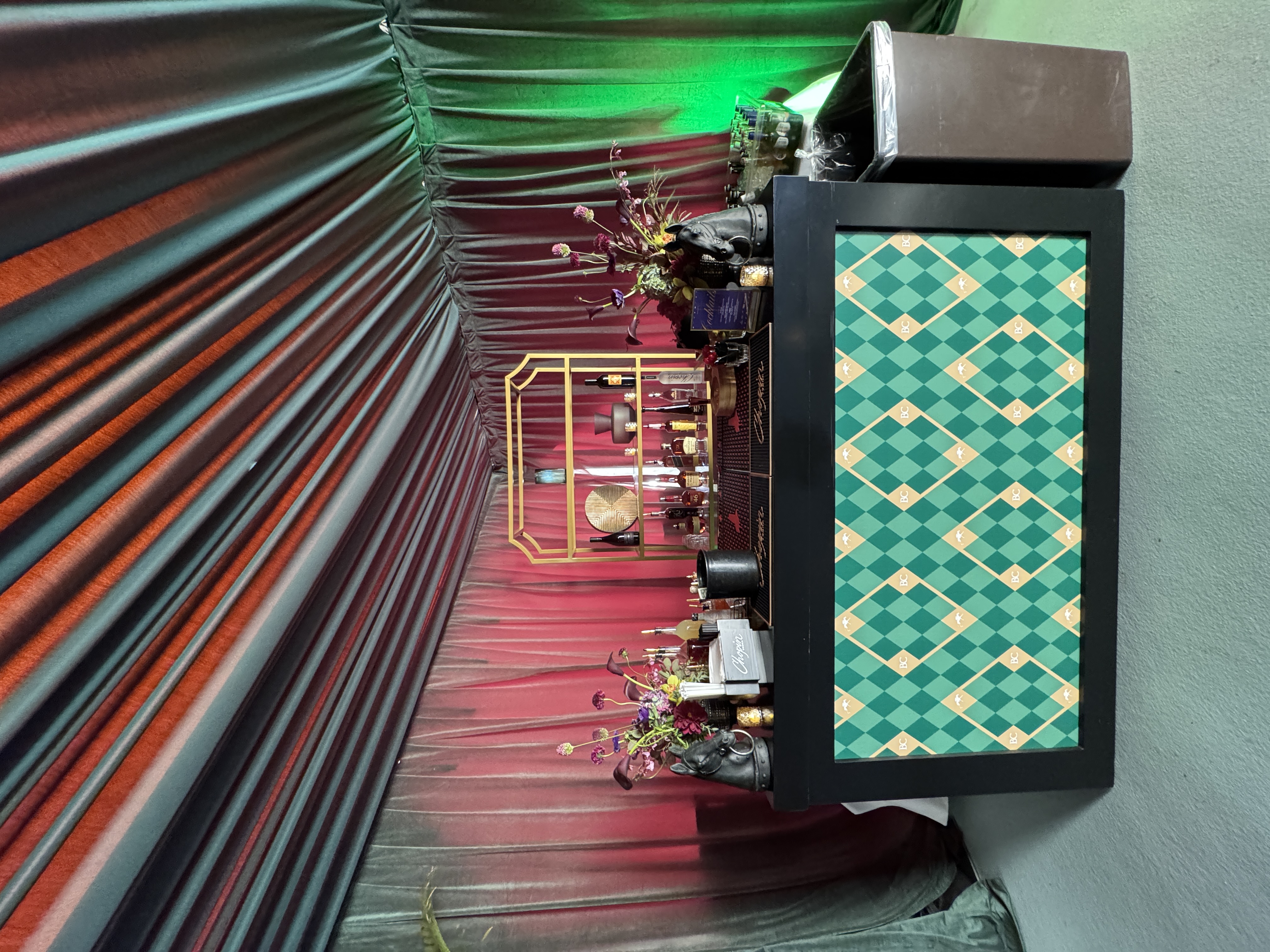
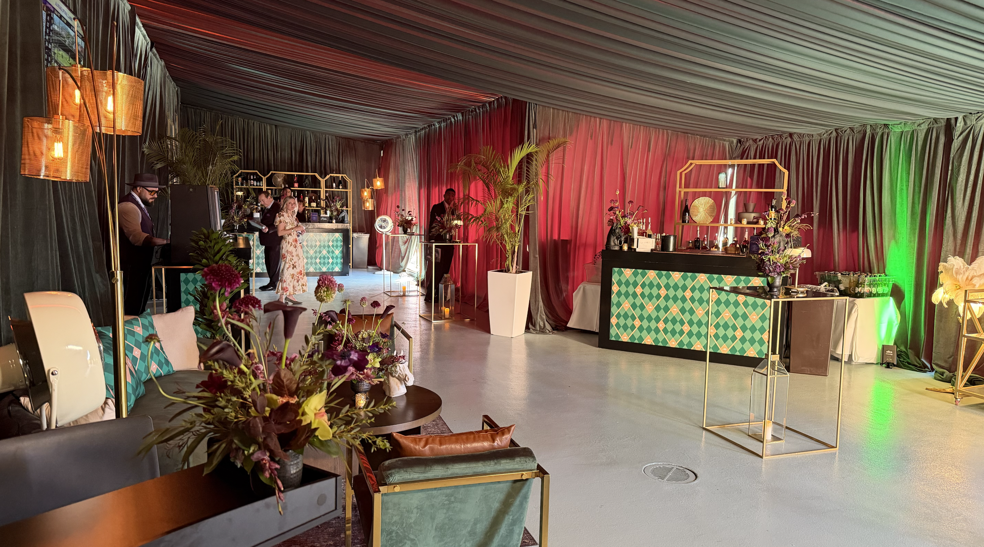
Speakeasy
Creative Director: Garrett Beach
Art Directors: Jenny Park, Bridget Halliday, Matt Tornetto
Designer: Julianna Santolucito
Copywriter: Susie Schmank
Production Managers: Matt Slamon, Megan Wheeler, Kyle Zimmerman, Derek Suiter, Morgan McDonald, Jill Debenito, Jake Shea
Production Artists: Amy Luna, Keith Miller
Account Executives: Kate Michels, Sophie Chrisco, Erin Schuster, Jannina Almeida, Samantha Dulle
Project Managers: Madison Kelmenson, Brianna Prosniewski
Redbreast Unhidden x SXSW
Art Direction – Experiential Marketing2025
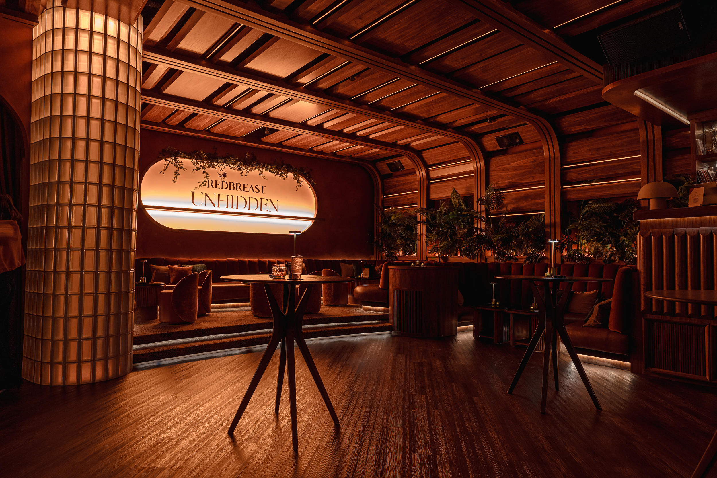

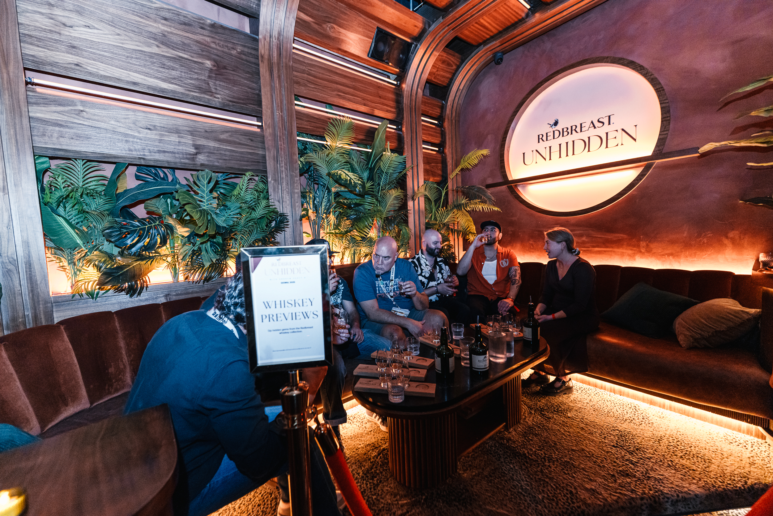
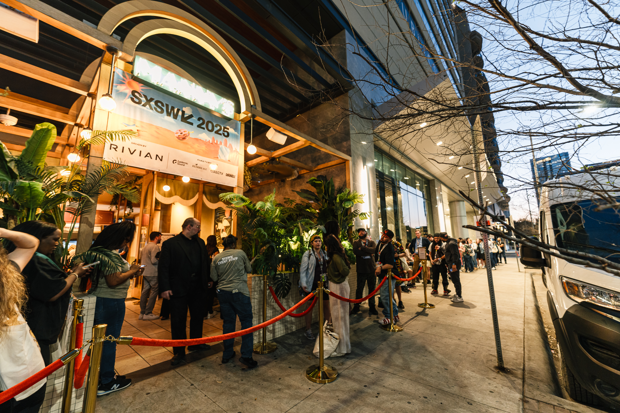
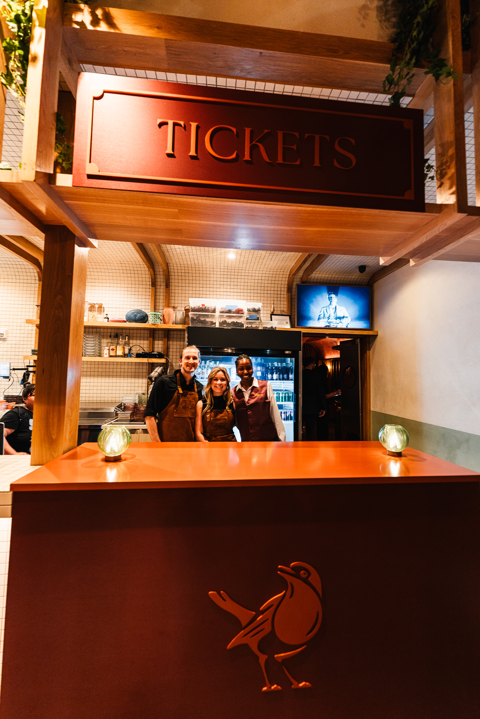
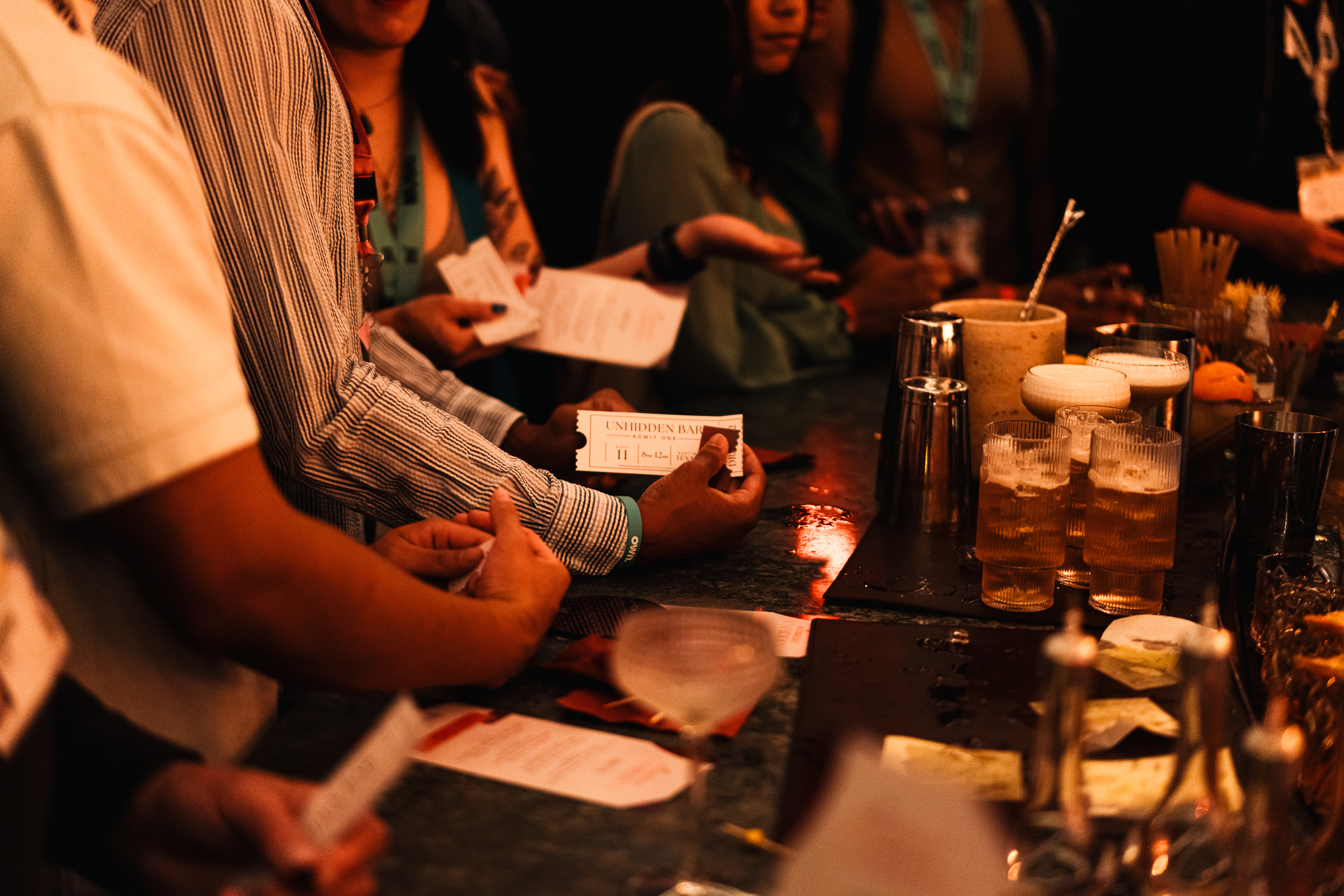
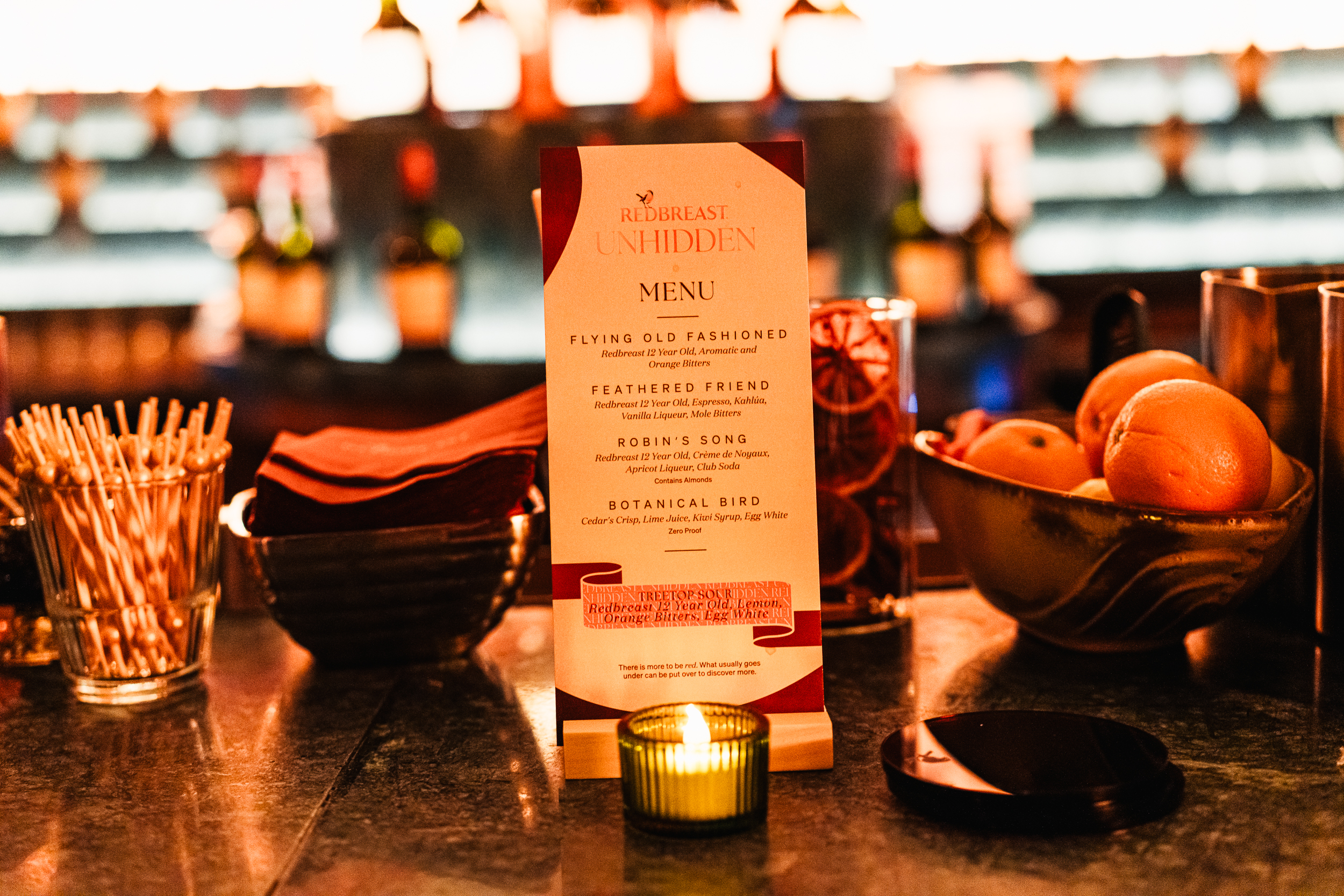
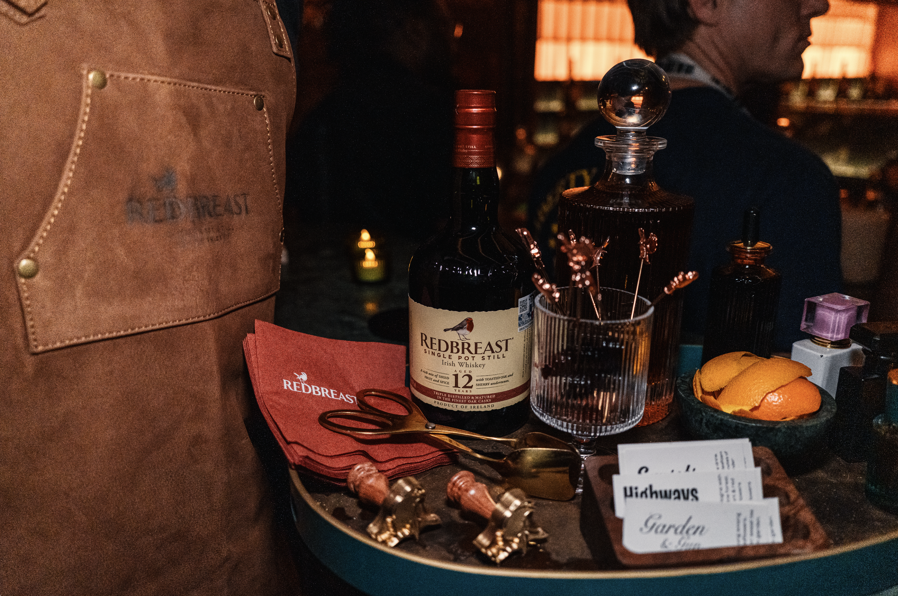
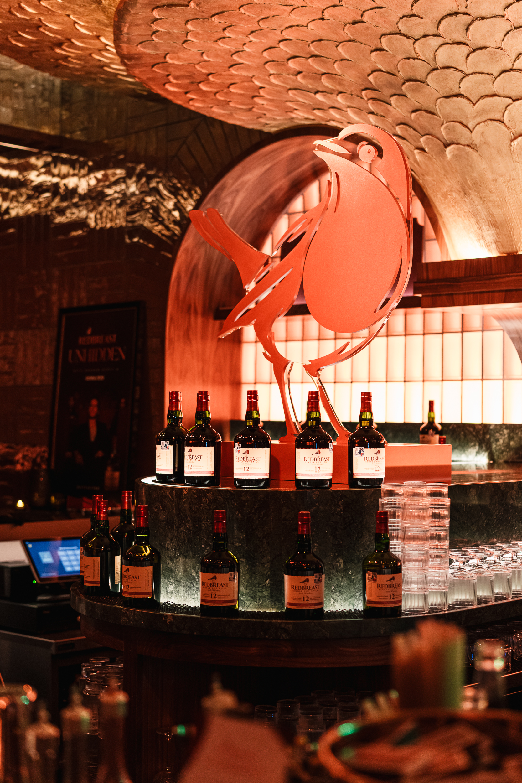
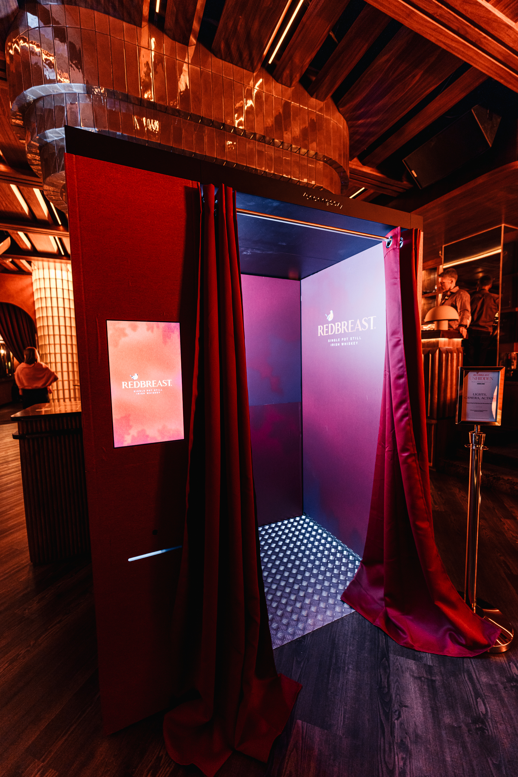
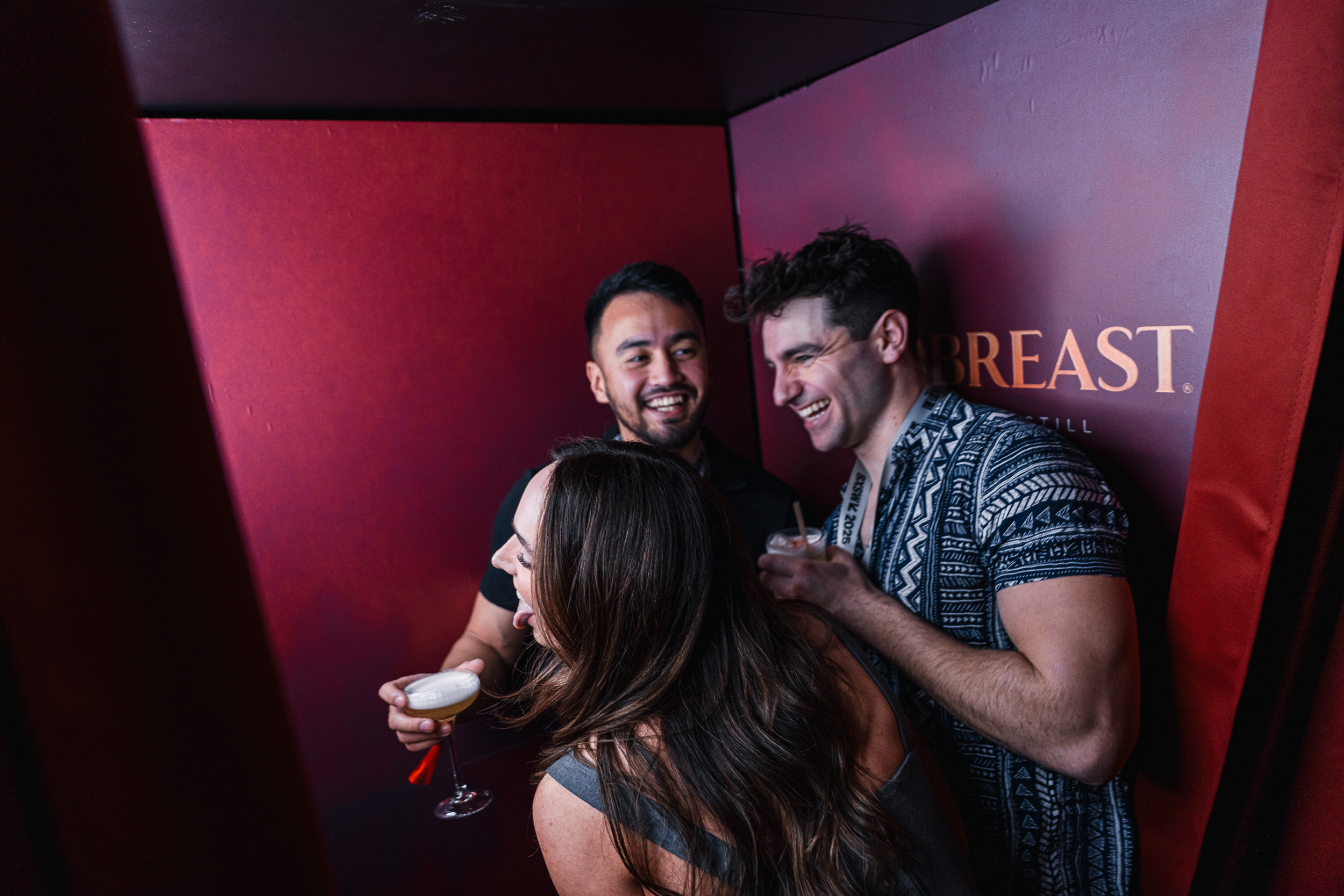
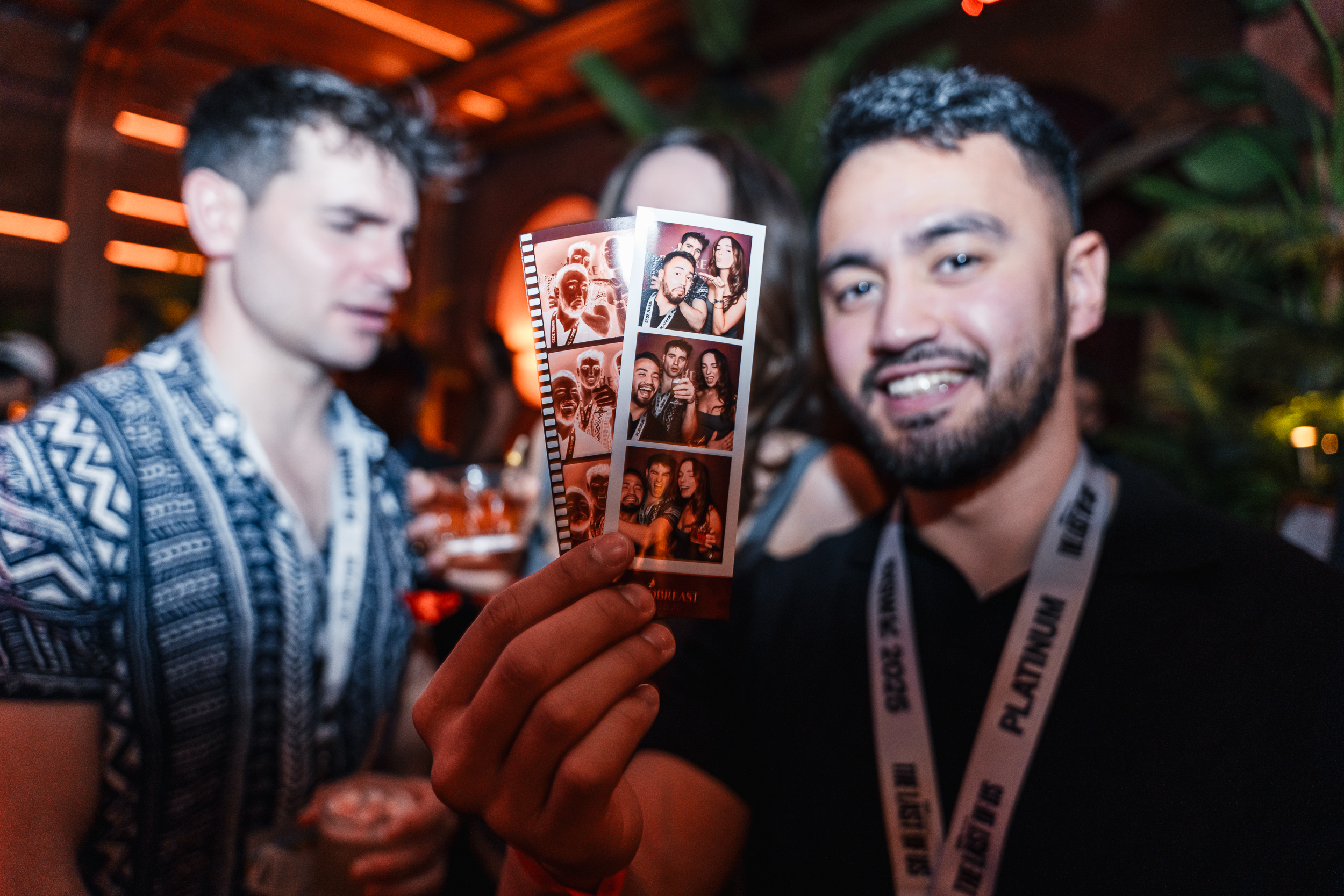
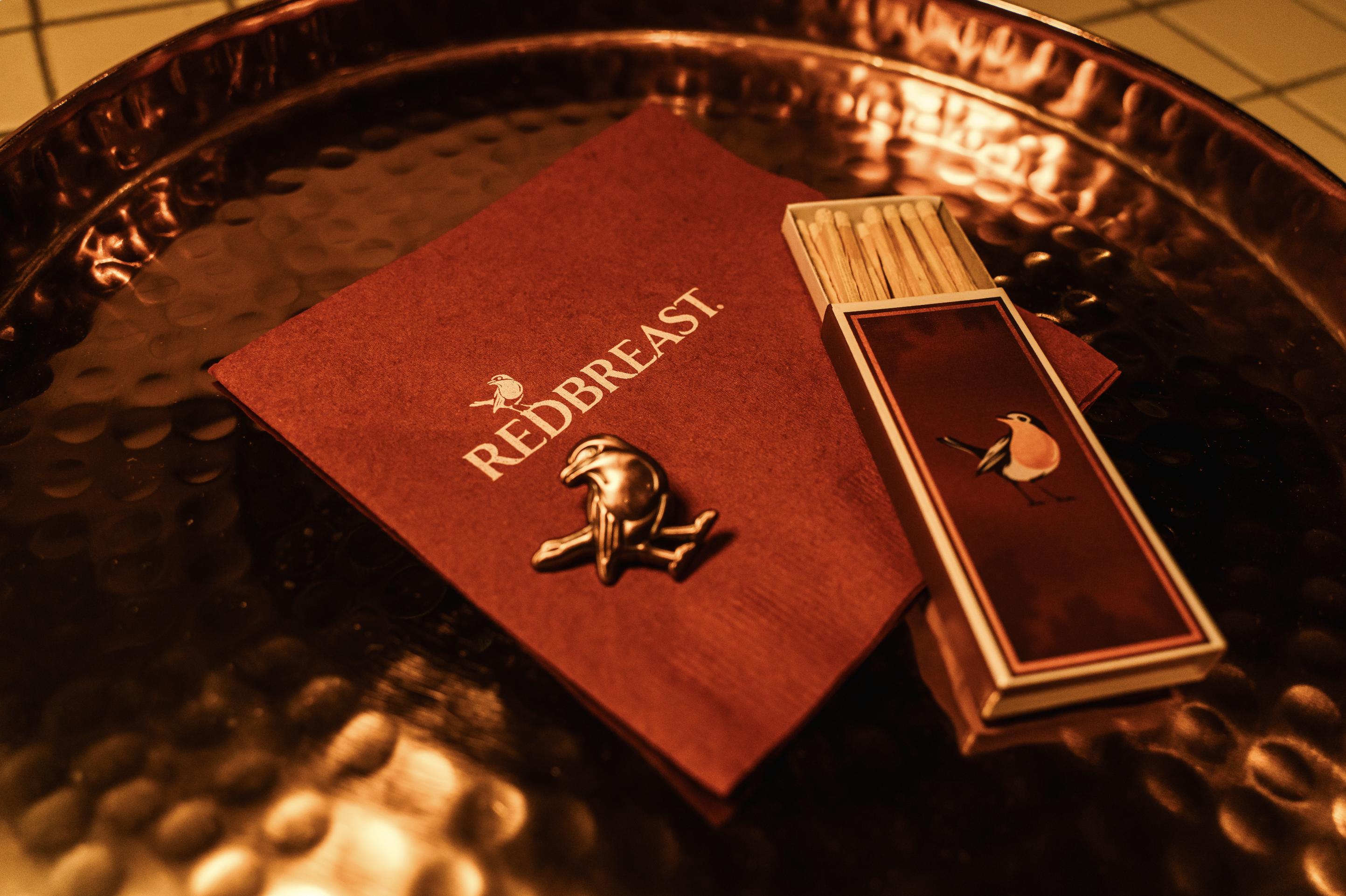
Redbreast showed up at South by Southwest 2025 as part of their Redbreast Unhidden program. This multi-night pop-up experience featured specialty cocktails, a whiskey tasting engagement, film-inspired photobooth, branded giveaways, DJ and live saxophonist, and plenty of unhidden gems for guests to discover. All three nights saw massive excitement, with the queue wrapping around the corner and an overall total of 1000+ guests in attendance. Hosted at Manny’s and The Powder Room in Austin, Texas, guests first entered Manny’s sandwich shop where they were greeted by BAs at a custom-fabricated ticket booth. Guests were then ushered through a secret kitchen entrance, revealing The Powder Room space and our Redbreast Unhidden Bar.
The central bar was the focal point of the activation space, featuring bottle display and an oversized copper Redbreast robin. As the cocktail strategy, we offered three bespoke cocktails plus a ‘secret menu’ cocktail, in addition to a dedicated whiskey sampling space and mobile live old-fashioned crafting.
A film-inspired photobooth lived within our space, complete with rich velvet curtains and elevated branded touches. Guests received two digital and physical photo strips, one version designed to look like a film negative and one as the developed ‘film’.
Creative Director: Katie Honig
Art Director: Bridget Halliday
Copywriter: Morgan Conley
Production Managers: Chris Haffner, Mike Brazil, Kyle Zimmermann
Production Artists: Amy Luna, Keith Miller
Account Executives: Eric Schneider, Rachel Beran, David Ederer, Lindsey Ormont
Project Manager: Rachel Rogers
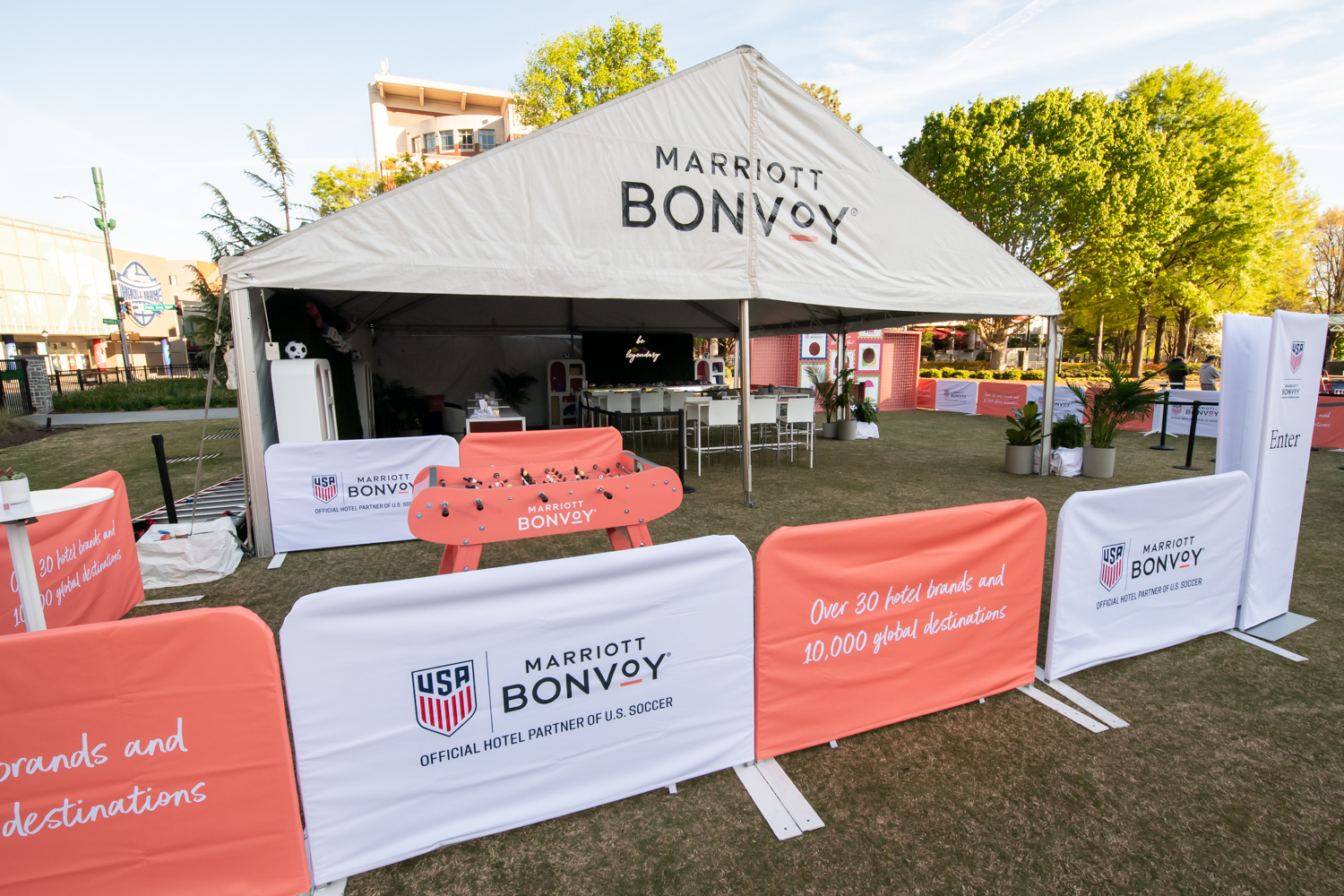
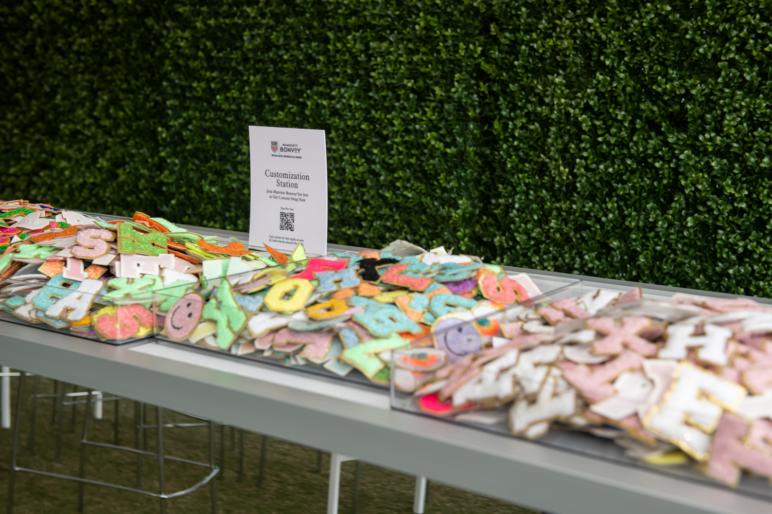
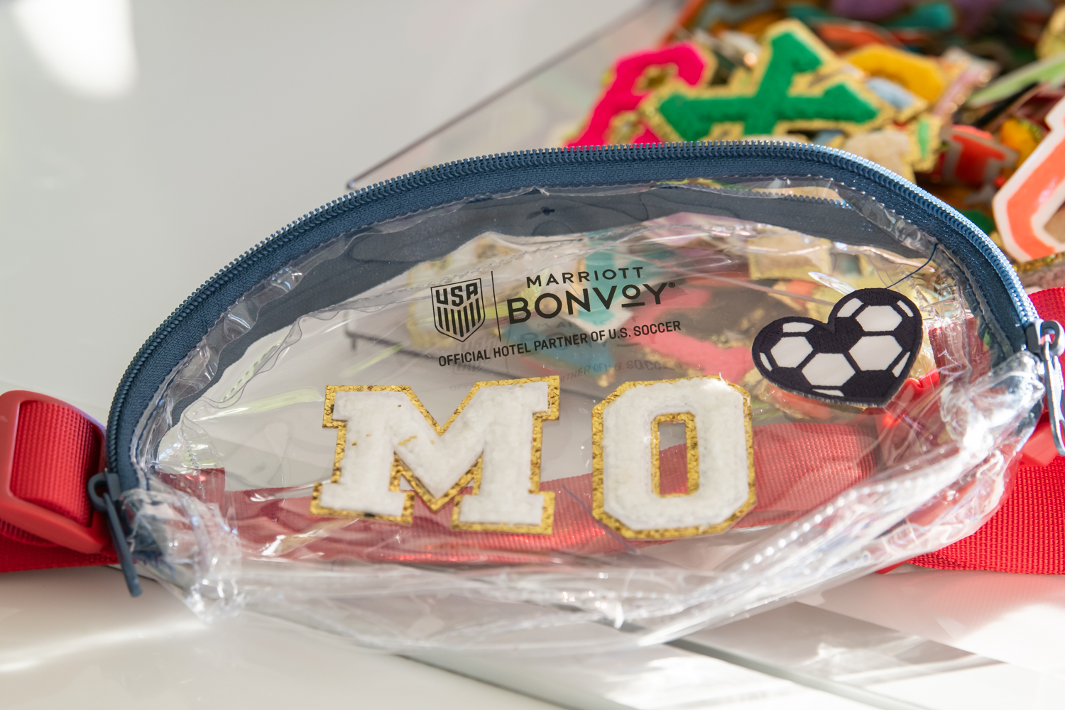
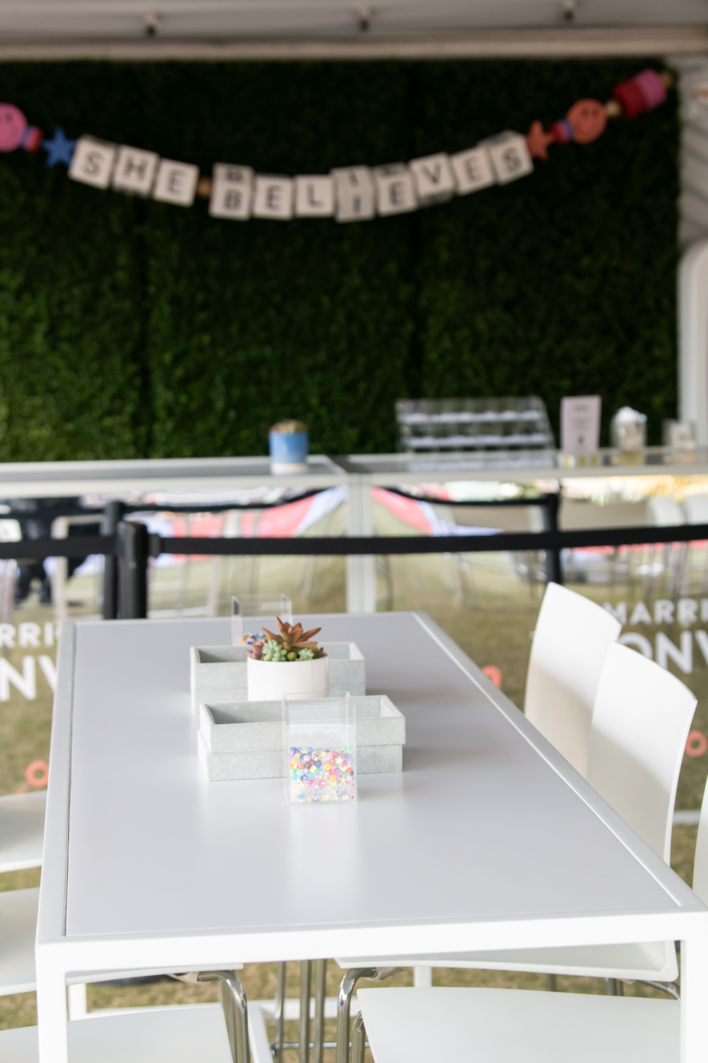
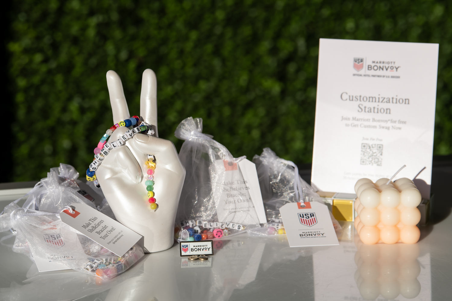
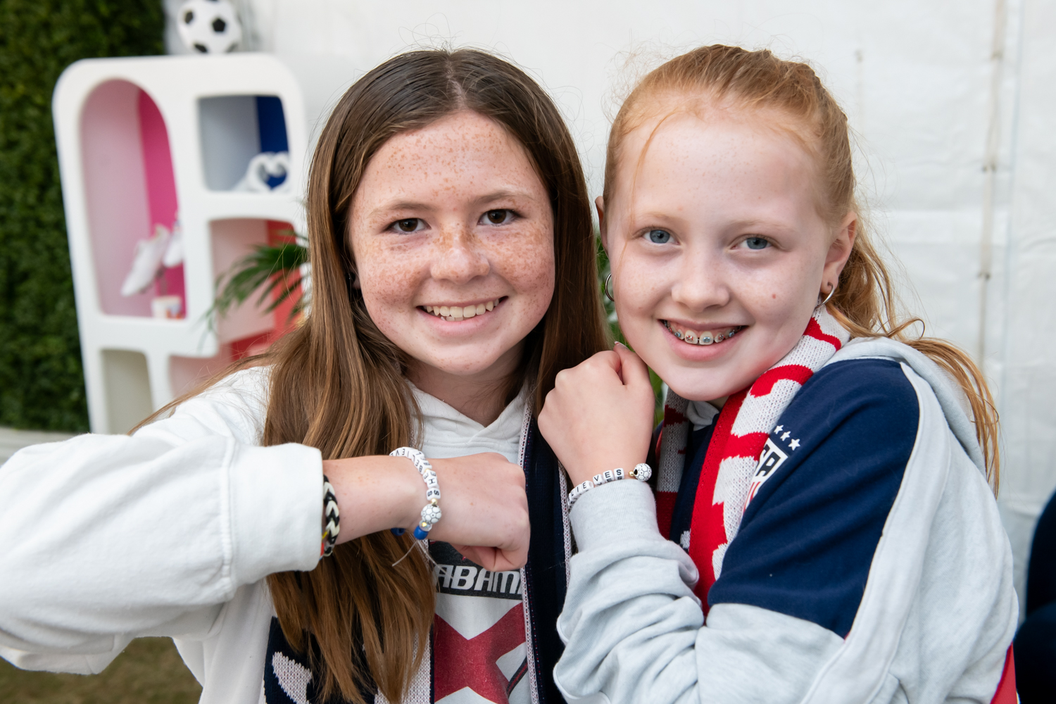
Marriott Bonvoy x U.S. Soccer SheBelieves
Art Direction – Experiential Marketing2024
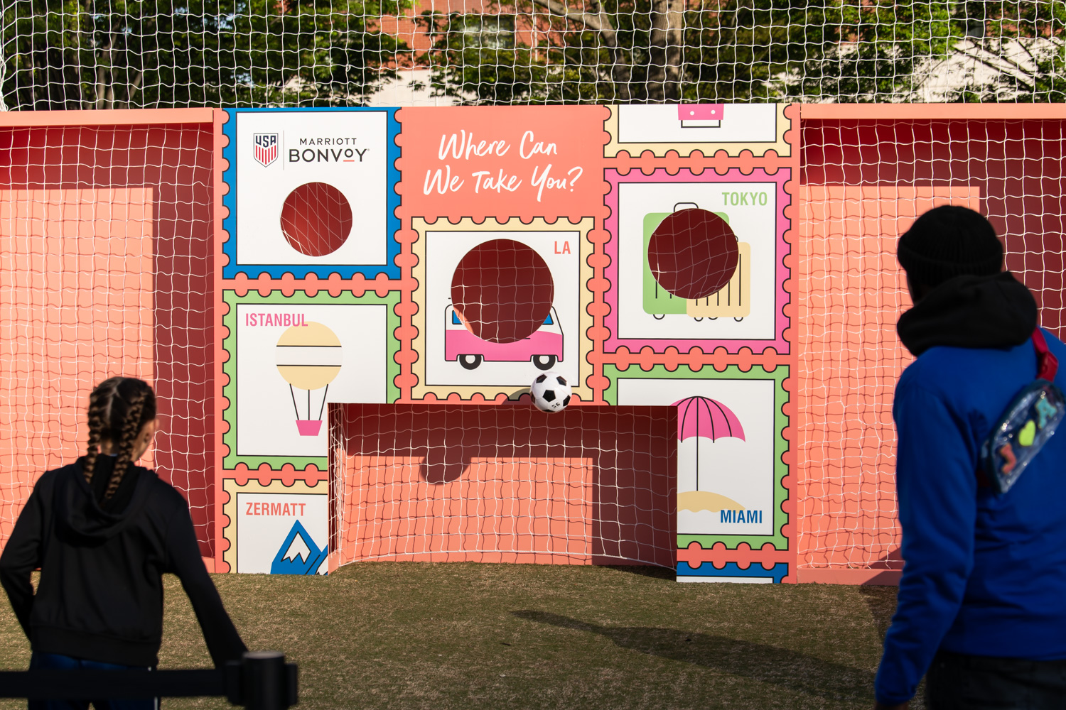
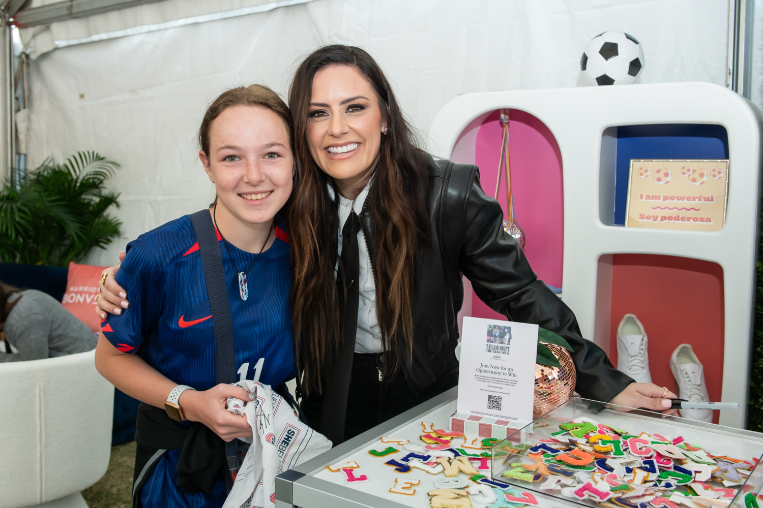
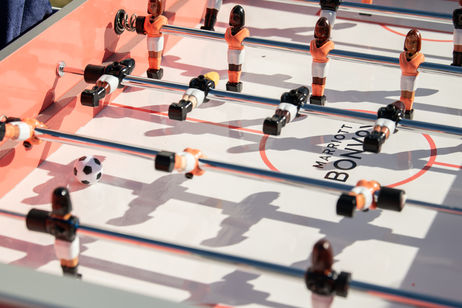
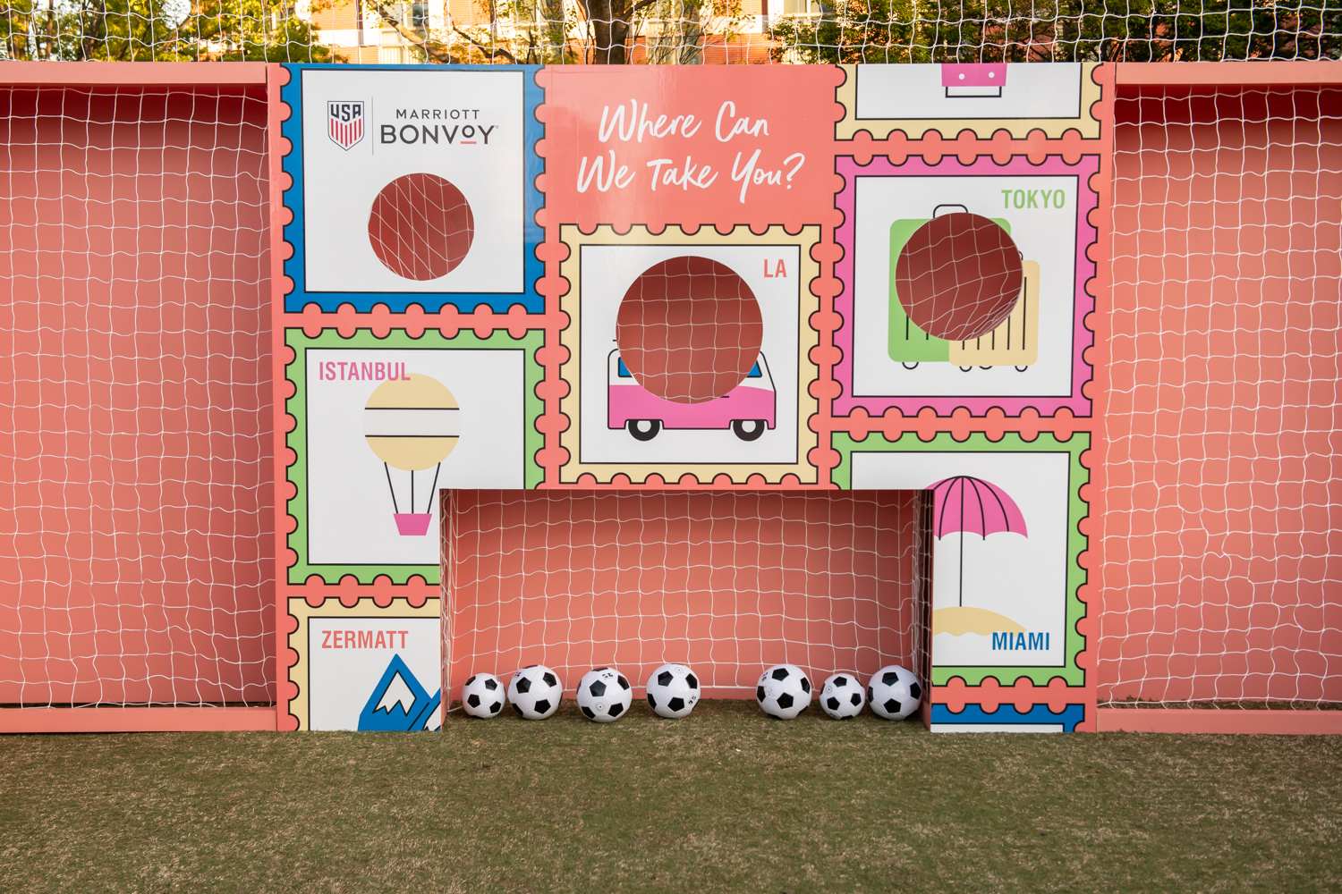
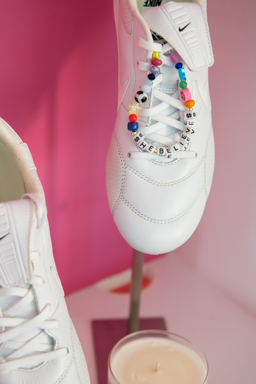
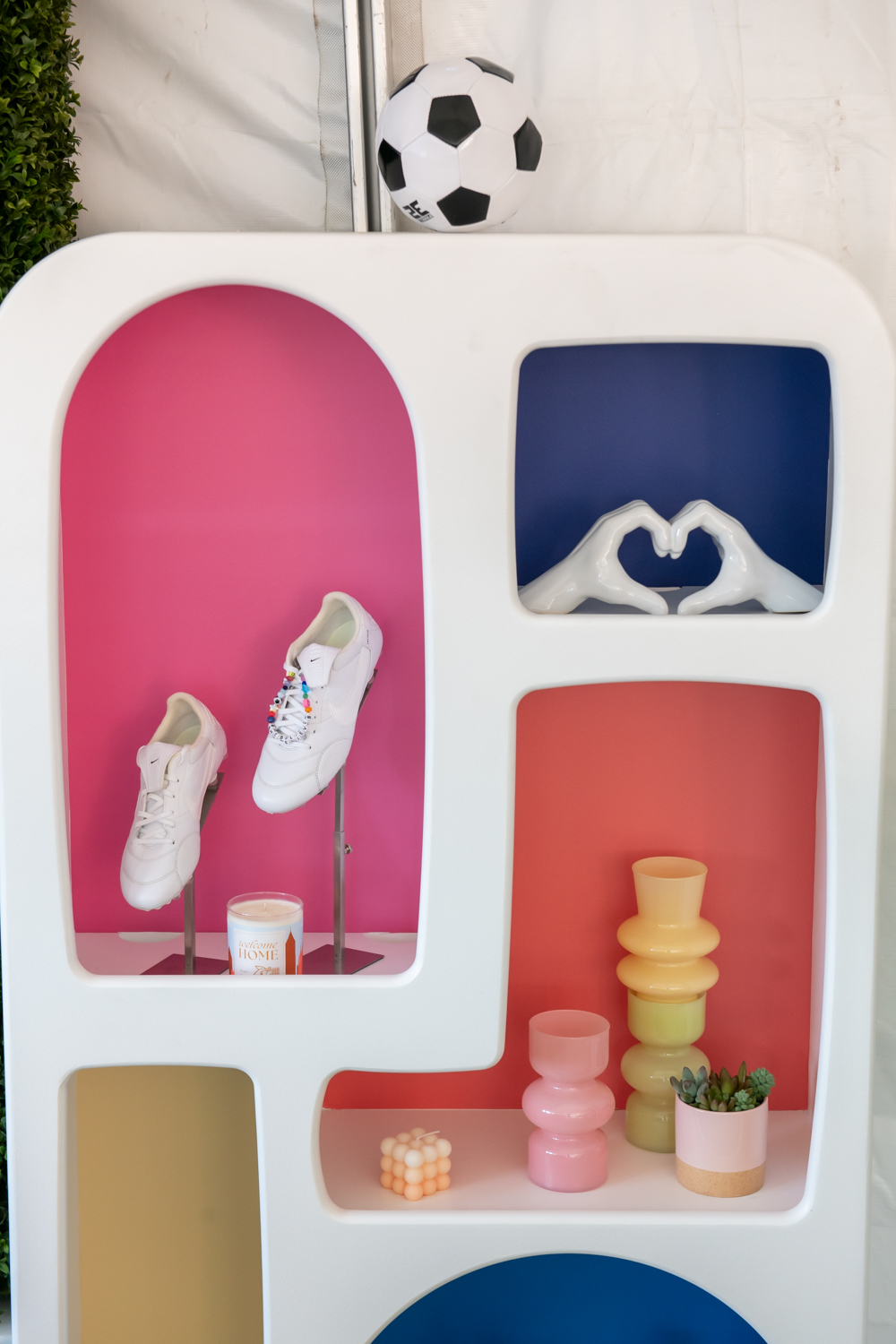
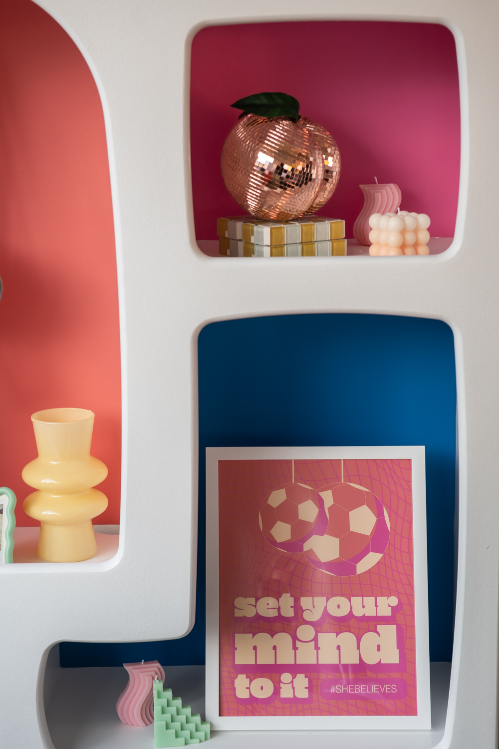
As the Official Hotel Partner of U.S. Soccer, Marriott Bonvoy showed up at the 2024 SheBelieves Cup in Atlanta, Georgia. The space featured multiple exciting, on-trend engagements, including a bracelet-making station, belt-bag customization station, talent meet-and-greets, and a custom kick wall and foosball table. Each activity, engagement, decor item, and overall event branding was purposefully curated to appeal to and empower young women and girls.
Guests could challenge each other to a game of foosball at our custom table painted in Marriott Bonvoy’s signature coral color and featuring diverse female soccer players. Guests could also take turns shooting at one of four ‘goals’ in our custom-fabricated kick wall. Inspired by Marriott Bonvoy’s “Where Can We Take You” tagline, the build featured a stamp design in our space’s colorway.
Colorful shelving throughout the space showcased vibrant and trendy decor items, soccer paraphernalia, and custom designed artwork.
Creative Director: Theresa Monahon
Art Directors: Morgan Farrell, Bridget Halliday
Copywriter: Madeline Houston
Account Executives: Samantha Dulle, Jenna Romanoff
Production Artist: Amy Luna, Keith Miller
Production Managers: Ali Prather, Sarah Beth Parlier, Kiley Kirkland
Project Manager: Rachel Rogers
Audi at Aspen Gay Ski Week
Art Direction – Experiential Marketing2024
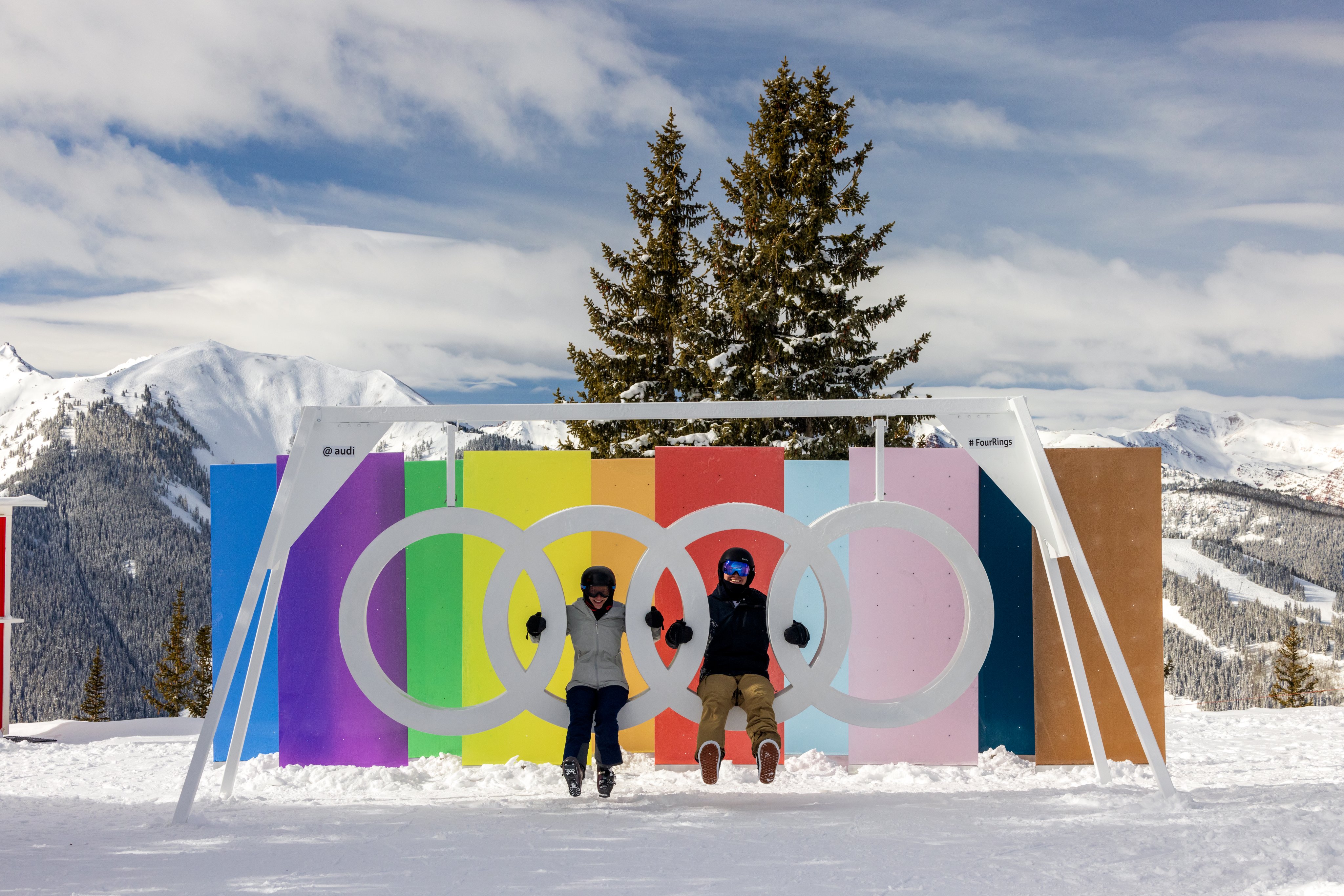
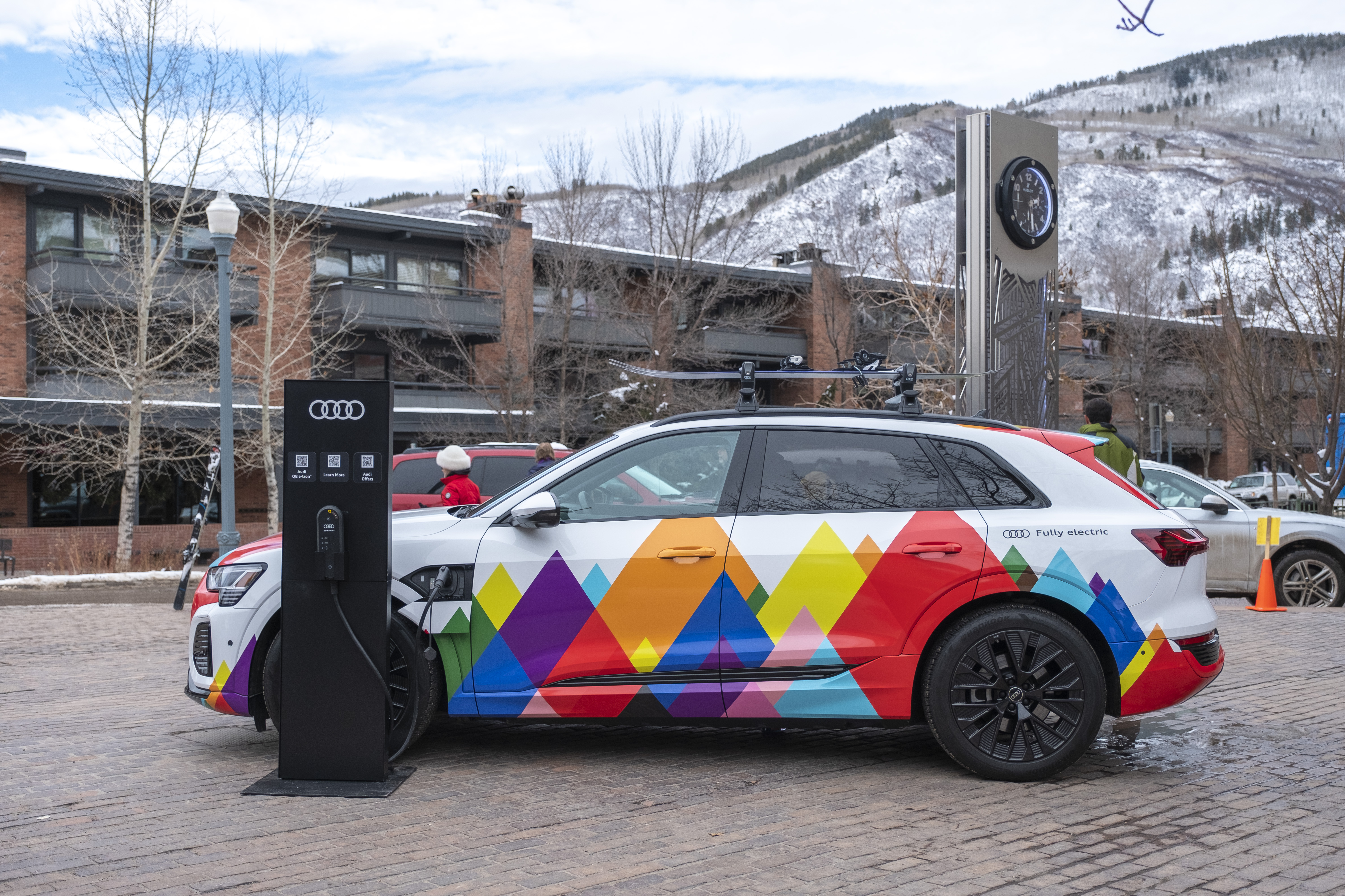
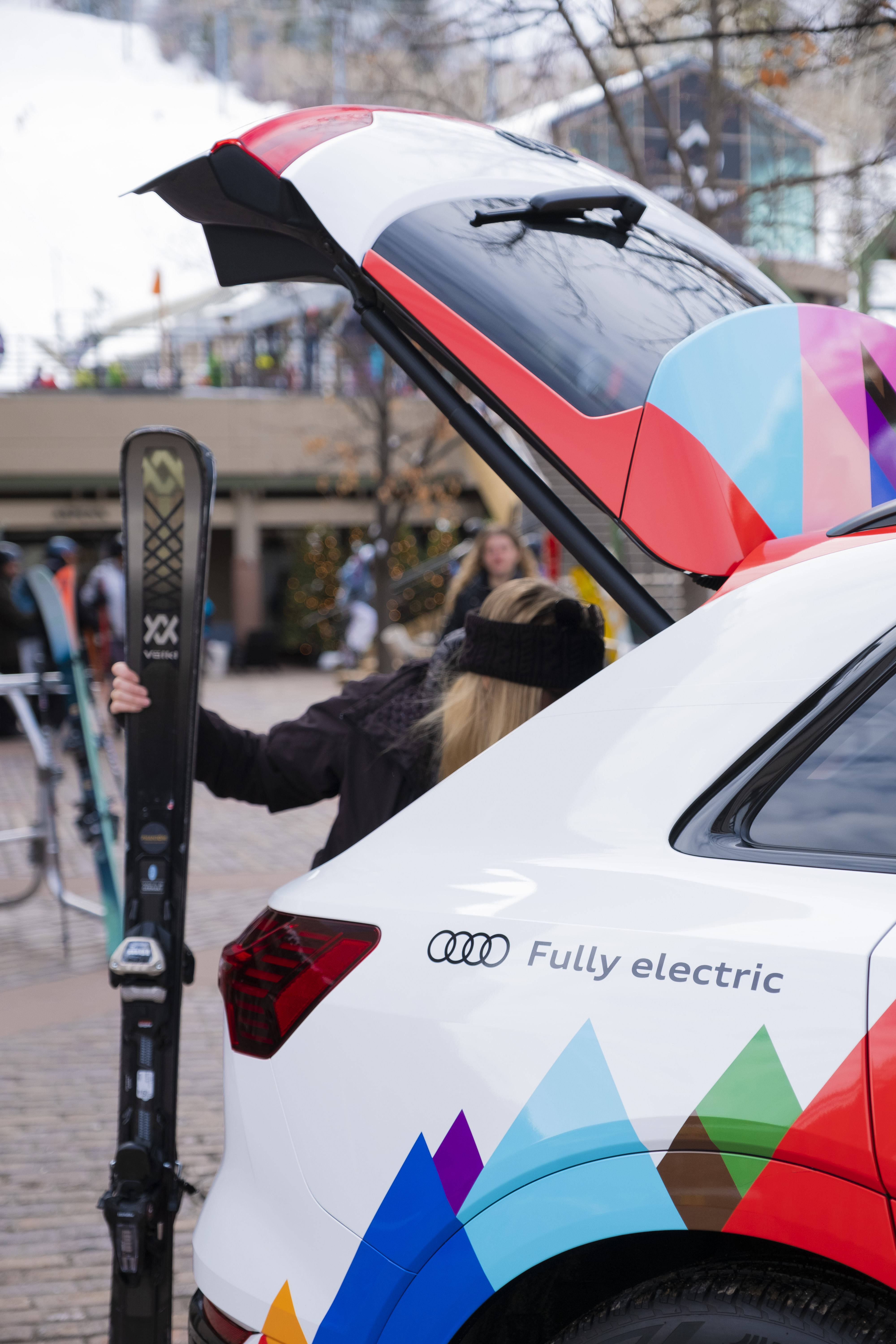
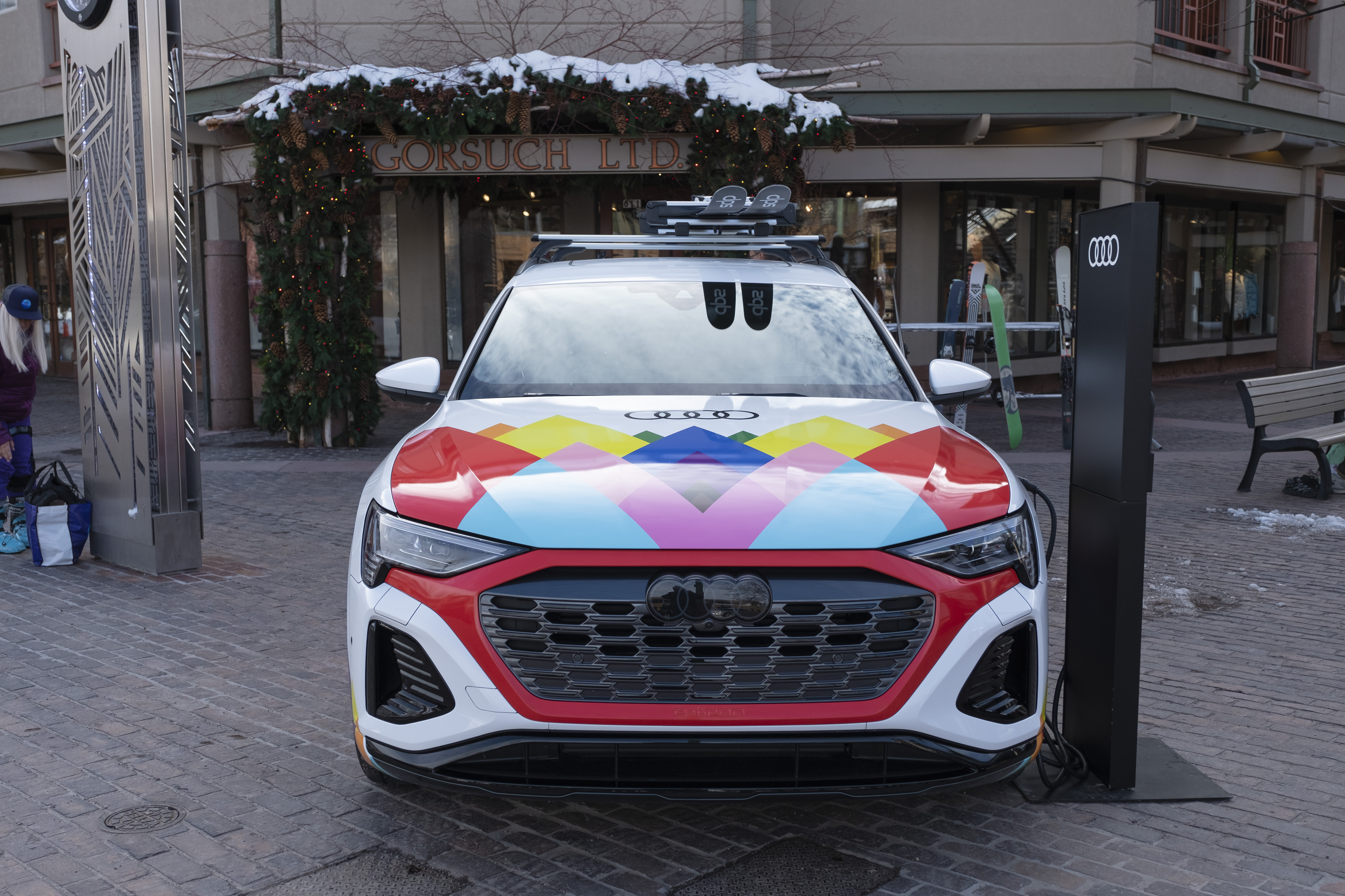
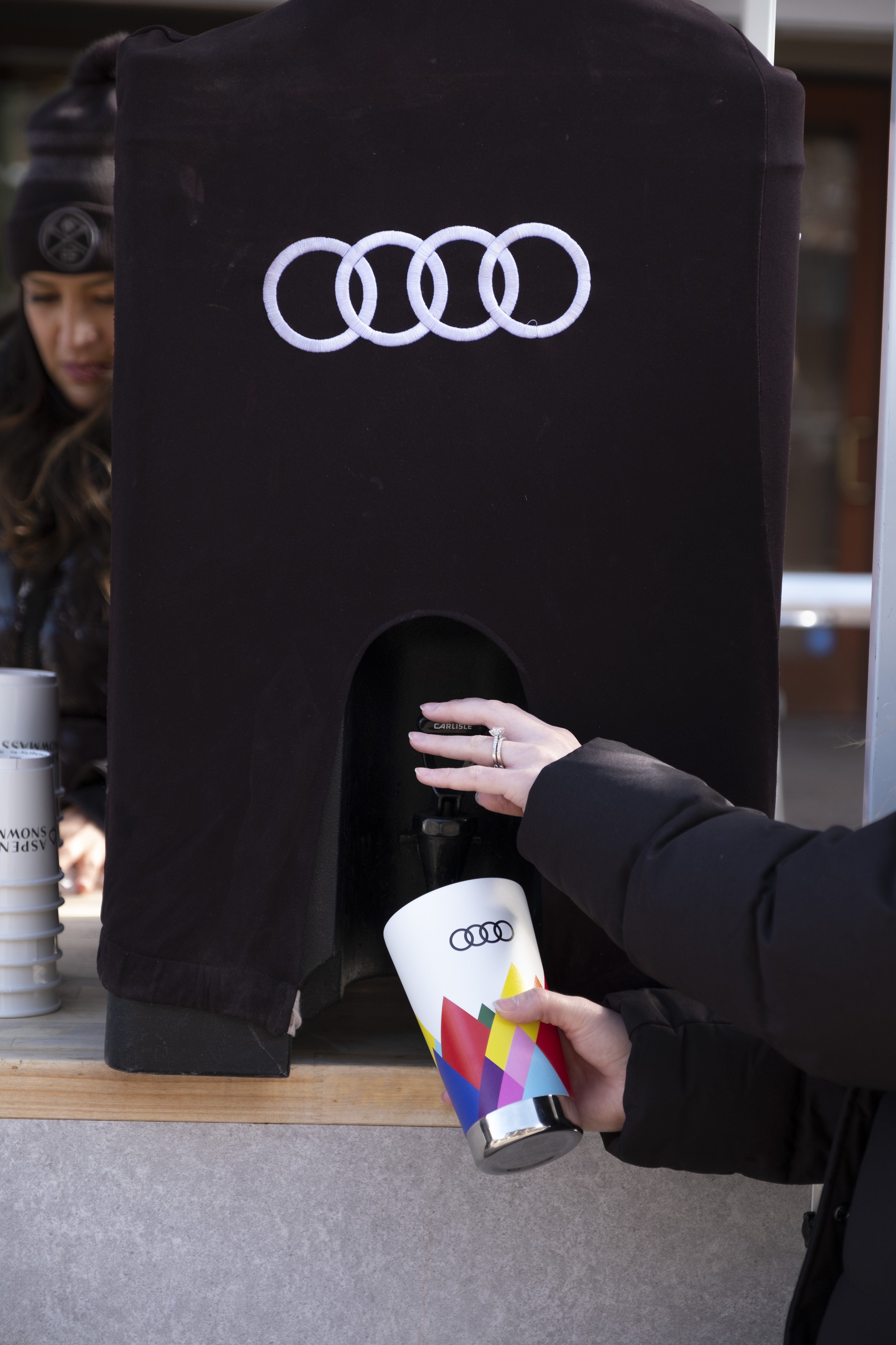
As part of Audi’s ongoing partnership with Aspen Snowmass, our team created impactful–and colorful–branded moments at Aspen Gay Ski Week, including a mountain-top photo opportunity, custom car wrap, and branded giveaways.
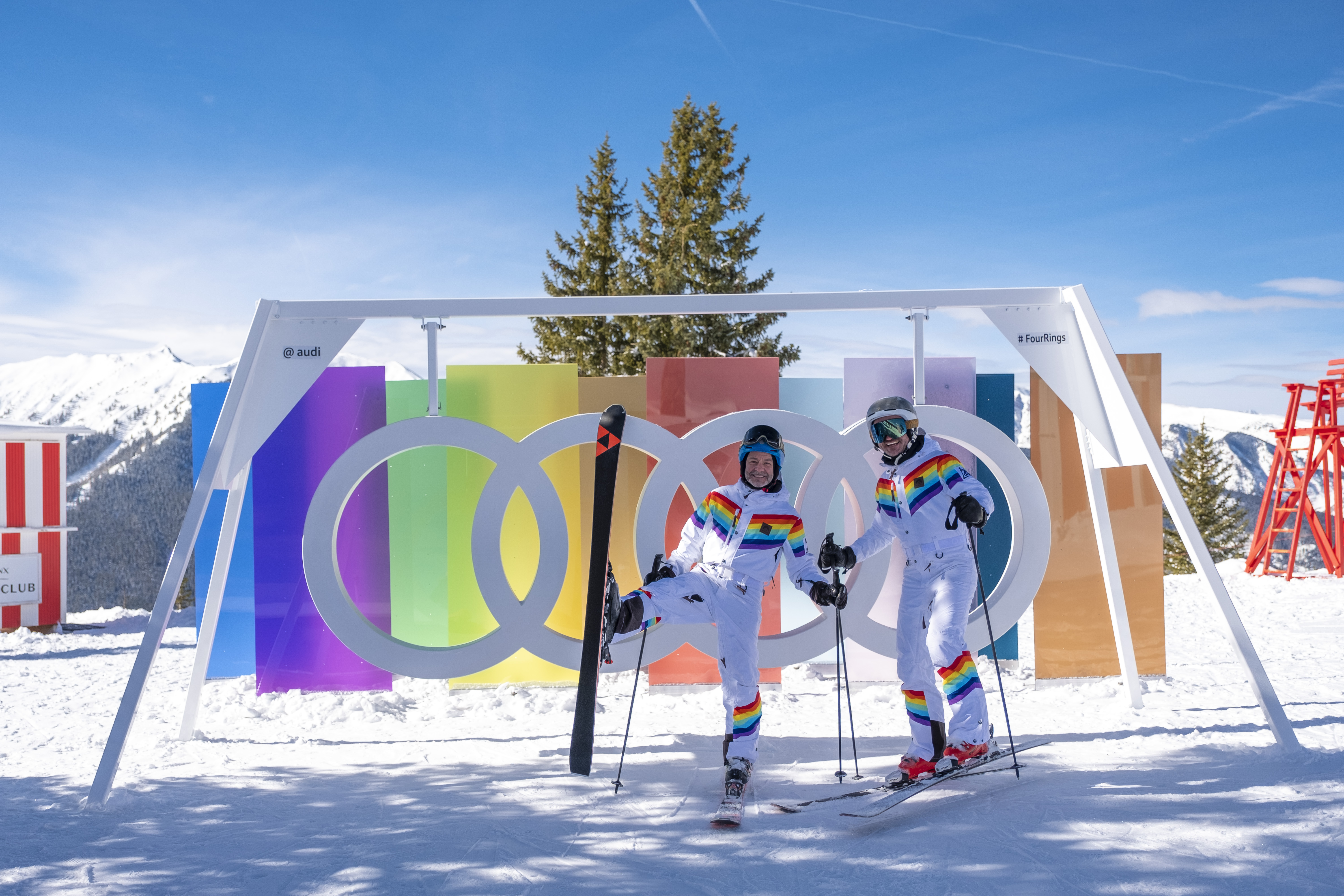
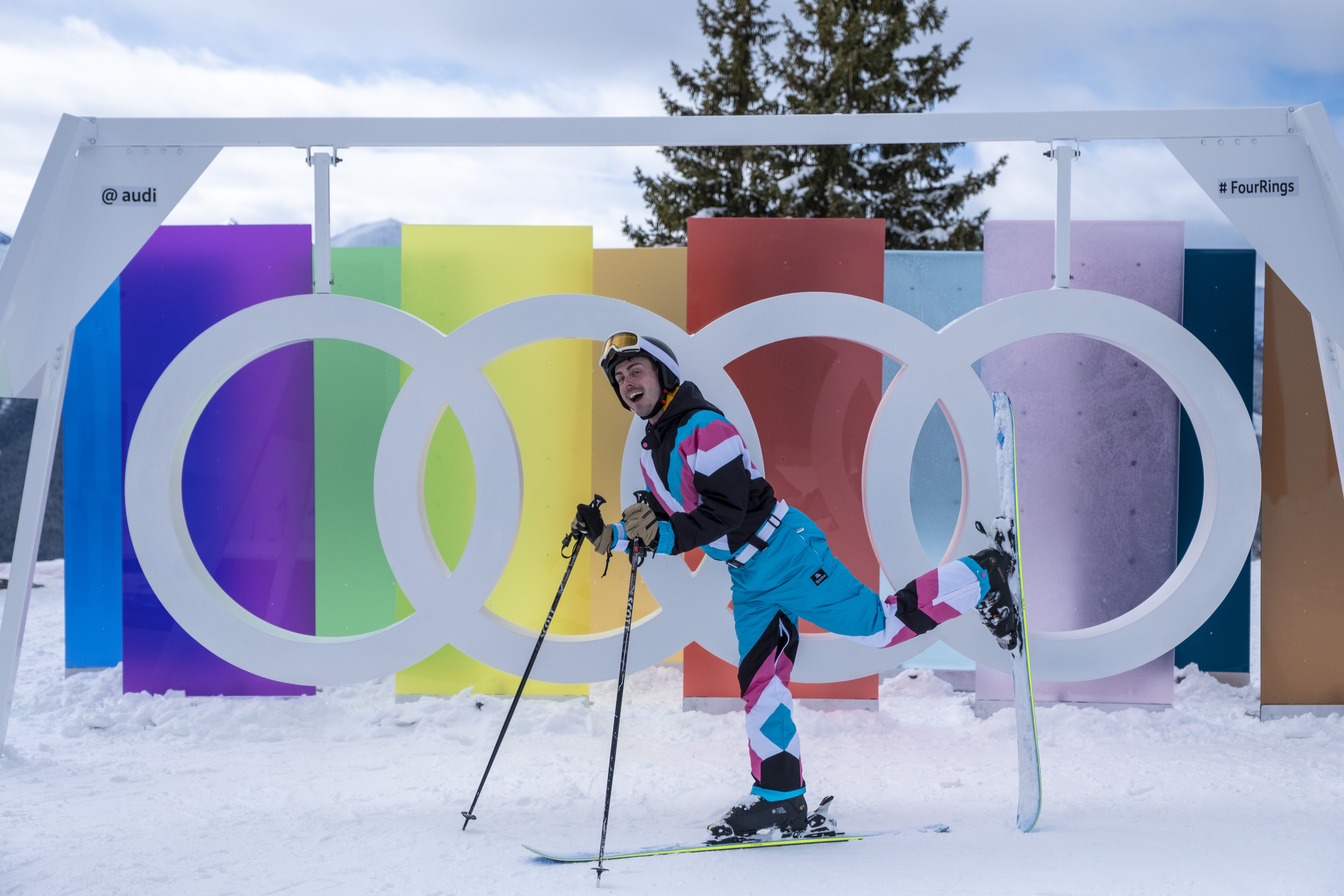
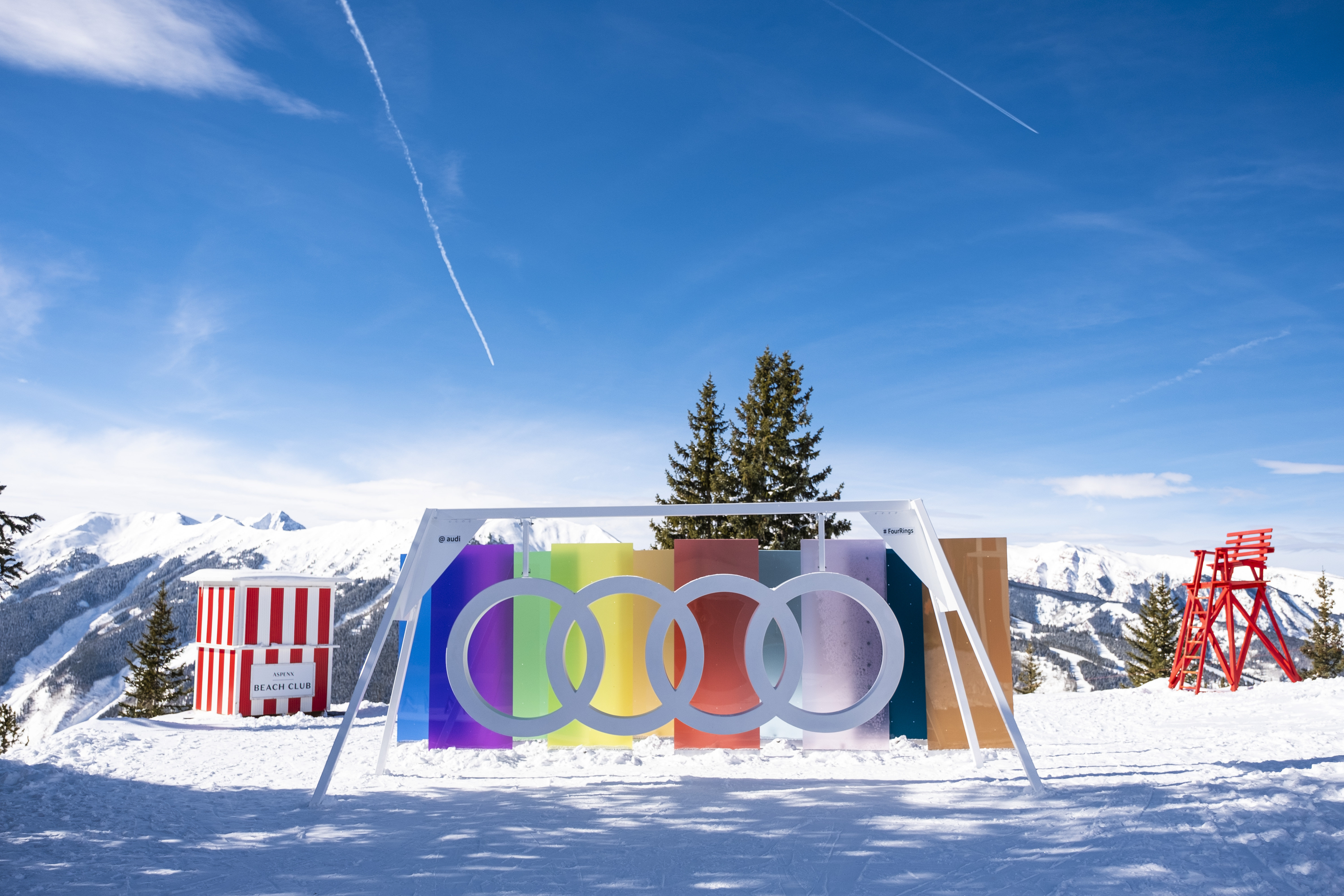
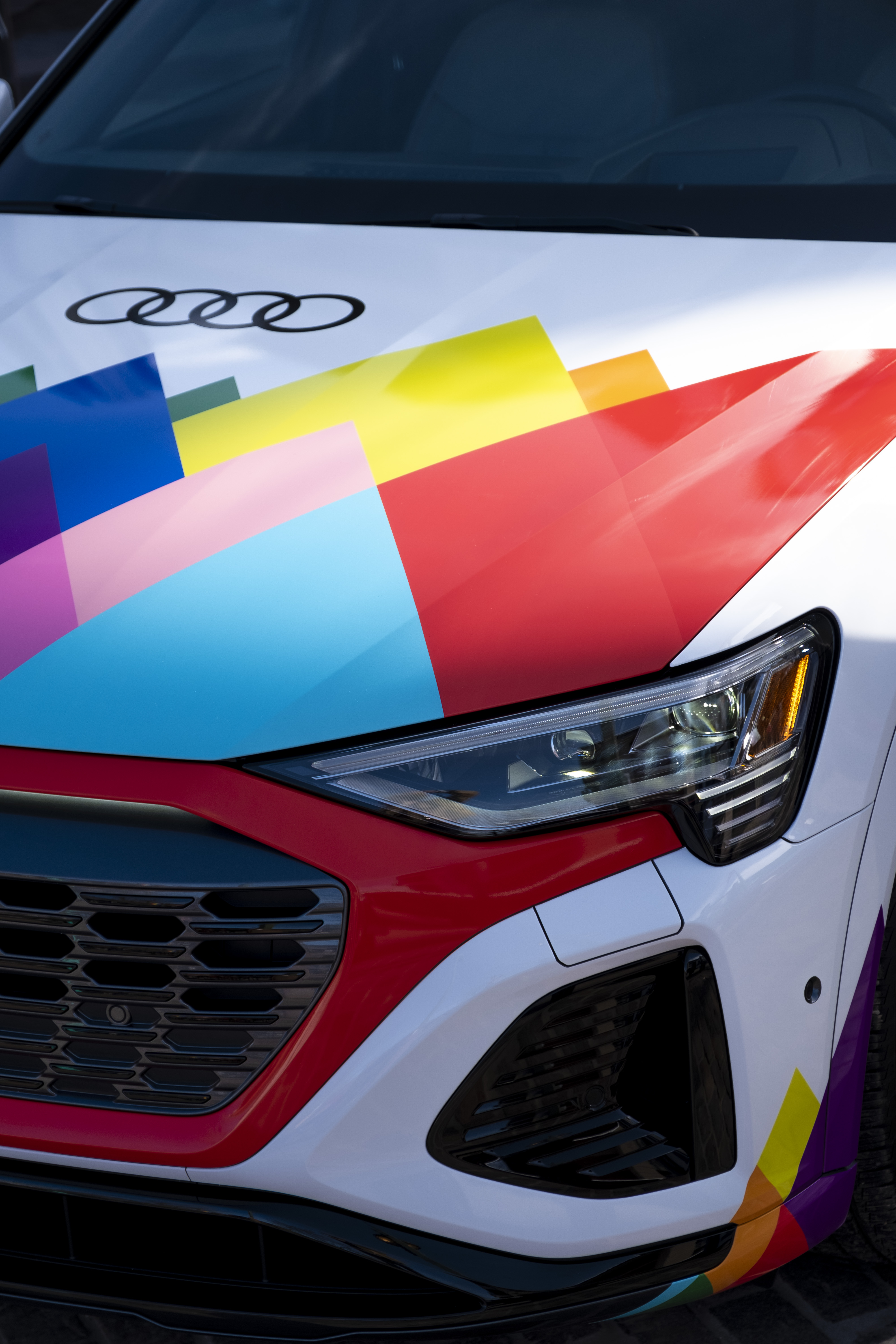
After exiting the gondola at the top of Aspen Mountain, skiers had the opportunity to show off their outfits by posing for a photo with our Audi Ring Swing (above), which featured 10 acrylic panels, one in each color of the Progressive Pride Flag. Skiers were encouraged to post their photos, tagging @Audi and #FourRings. Below, in Gondola Plaza, a custom-wrapped Q8 e-tron was prominently displayed. The design featured a geometric moutainscape in all the colors of the Progressive Pride Flag, Audi logos, and “fully electric” tagline.
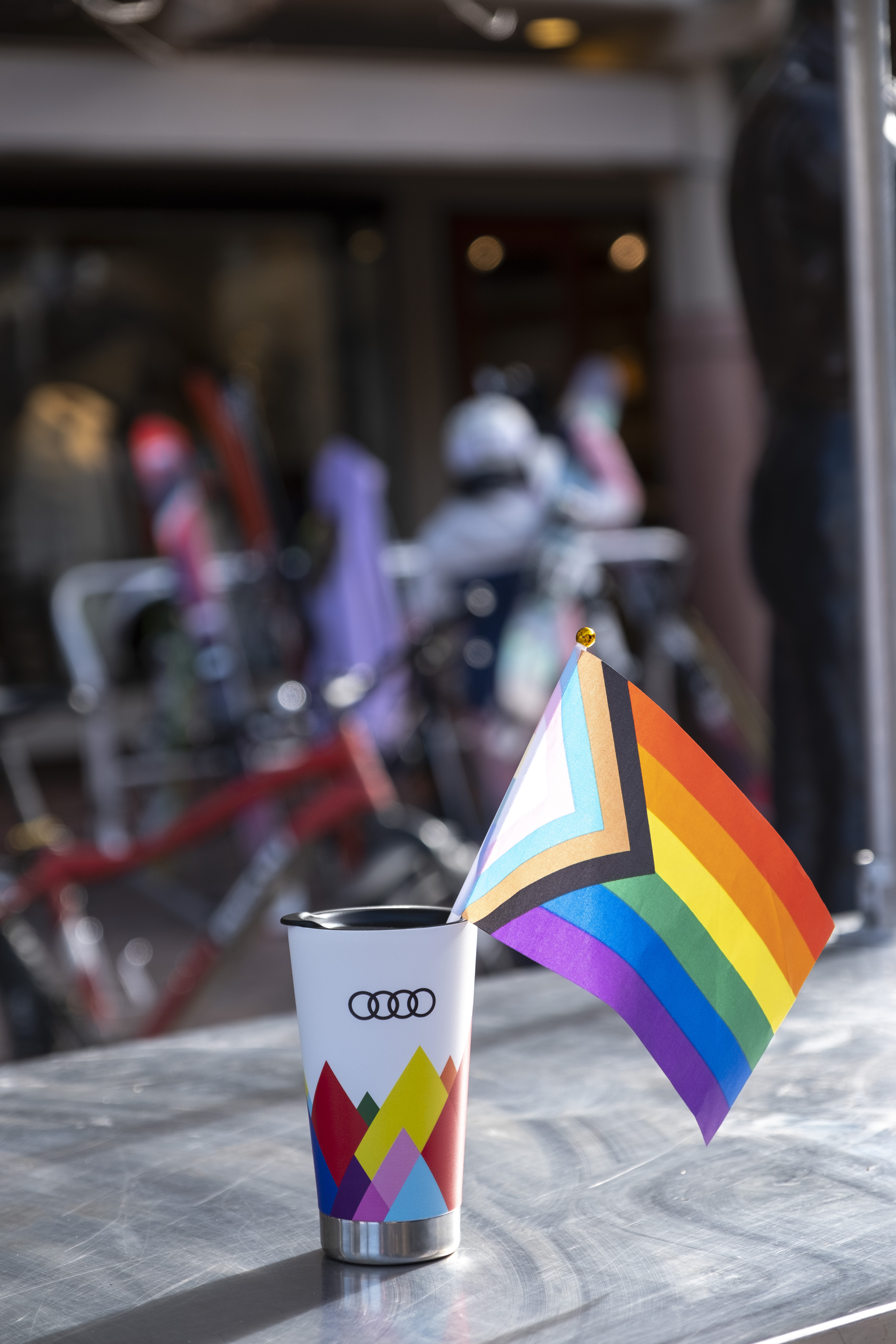
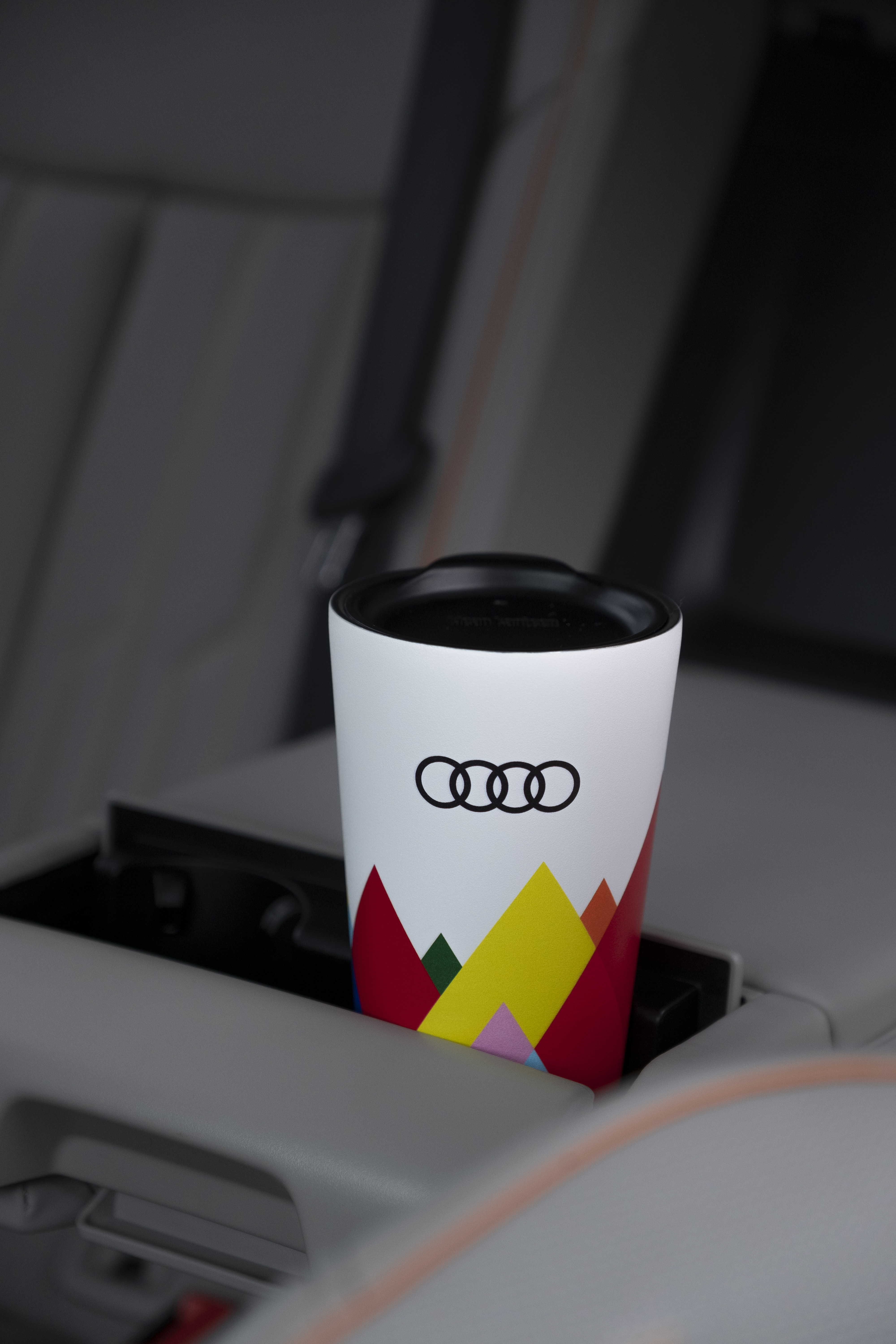
Custom branded Klean Kanteens in the same mountainscape design were given away to handraisers and could be used at our hot cocoa station.
Creative Director: Matt Tornetto
Art Director: Bridget Halliday
Copywriter: Morgan Conley
Account Executives: Samantha Voris, Ginalle Enrietti,
Production Artist: Keith Miller
Production Managers: Jill Debenito, Mandy Heumann, Morgan McDonald
Project Managers: Nicole Hagemann
All photos are property of Audi of America
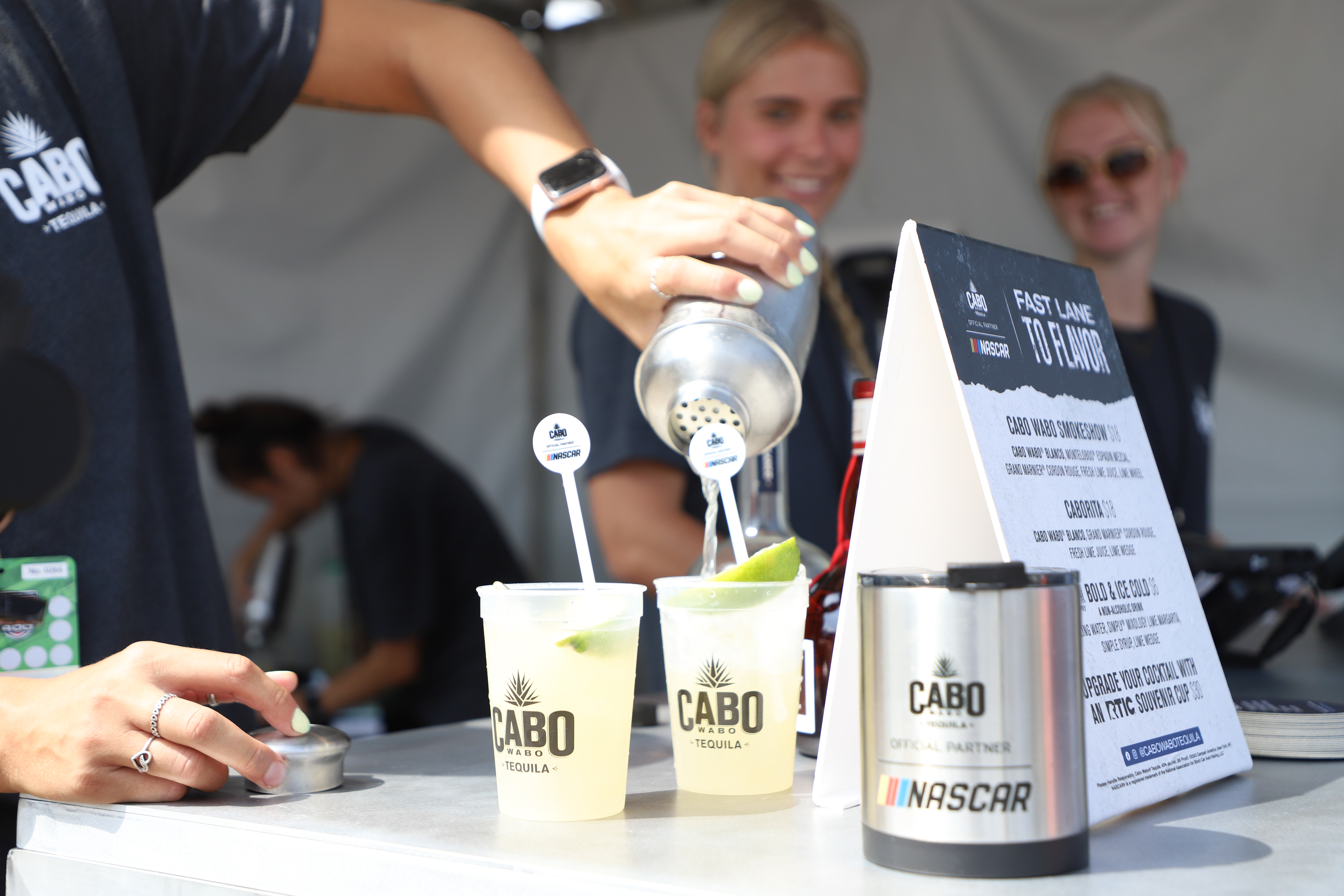
Cabo Wabo Tequila x NASCAR Experiential Tour
Art Direction – Experiential Marketing2023


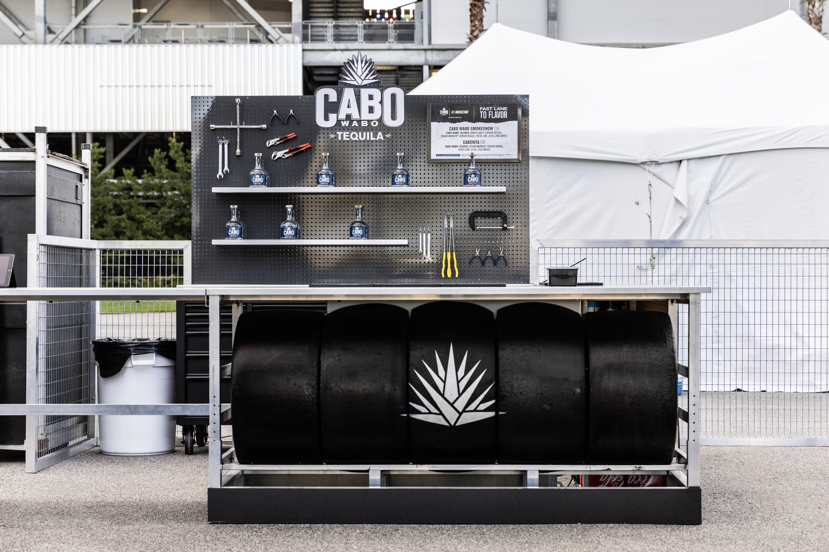
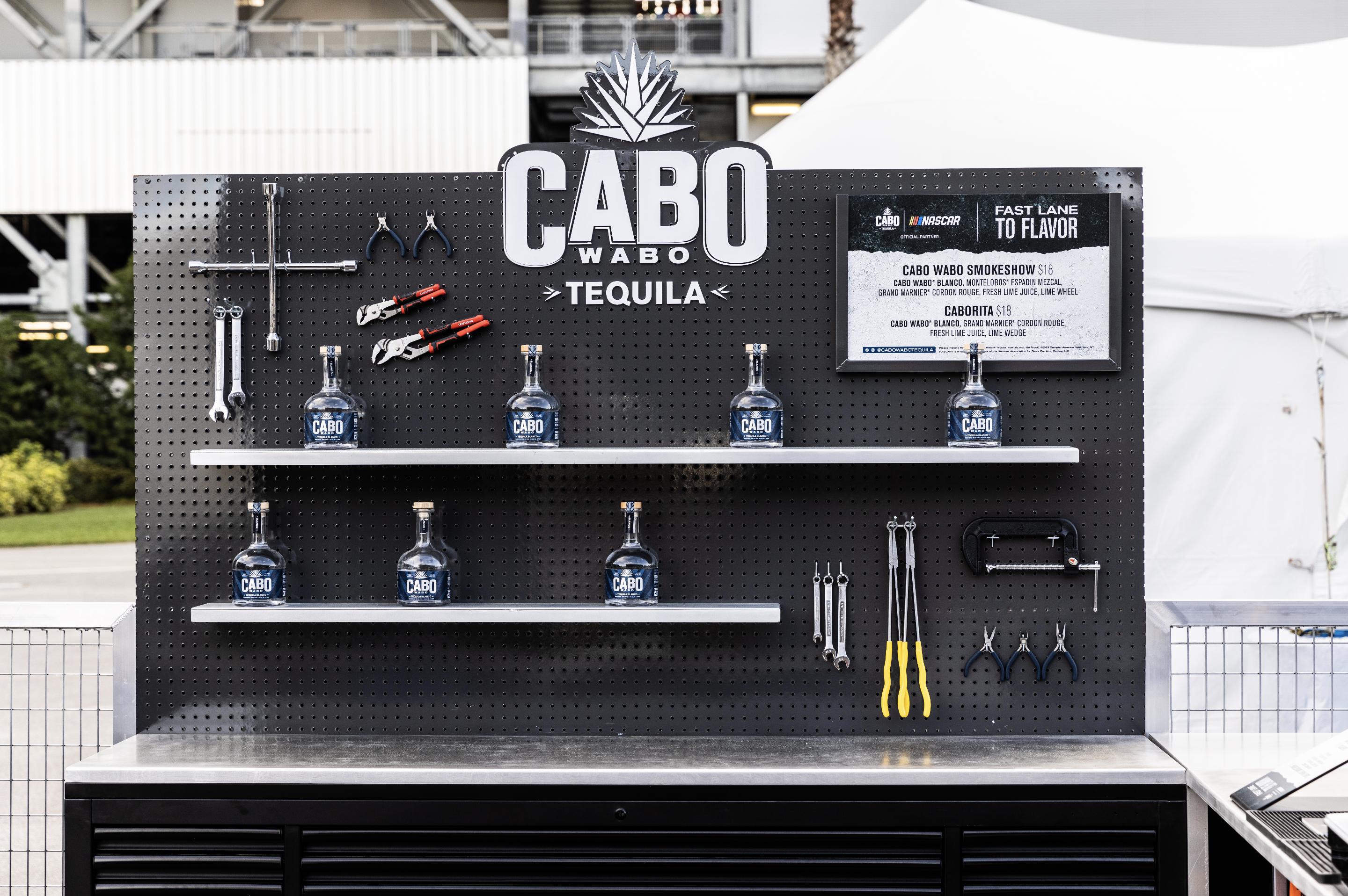
Our client, Cabo Wabo Tequila, is the first tequila sponsor of NASCAR. We were tasked with developing a ‘thick-cut’ and badass activation footprint to show up at NASCAR’s most famous racetracks. Our team created the Cabo Wabo Garage, a fully decked out 30x30 space with a custom bar, photo op, and water refill station. As junior art director on the team, I took part in brainstorming and ideation, material selection, and bar and photo op comps. I also lead the development of the signage creative alongside our copywriter. At Talladega and Daytona racetracks, I designed custom wraps and creative for three satellite bars. In just 11 activation days (and a few more still to go in 2023), Cabo has gained over one million on-site impressions, over 27 million media impressions, and sold nearly 4000 cocktails.
The bar and backbar (below) were designed to look like it came straight from a car-fanatic’s garage. The tire-rack bar feature authentic racing tires with a painted Cabo agave emblem. A brushed stainless steel bar top wraps around the side to the backbar, where a branded pegboard holds shelving and tool display.


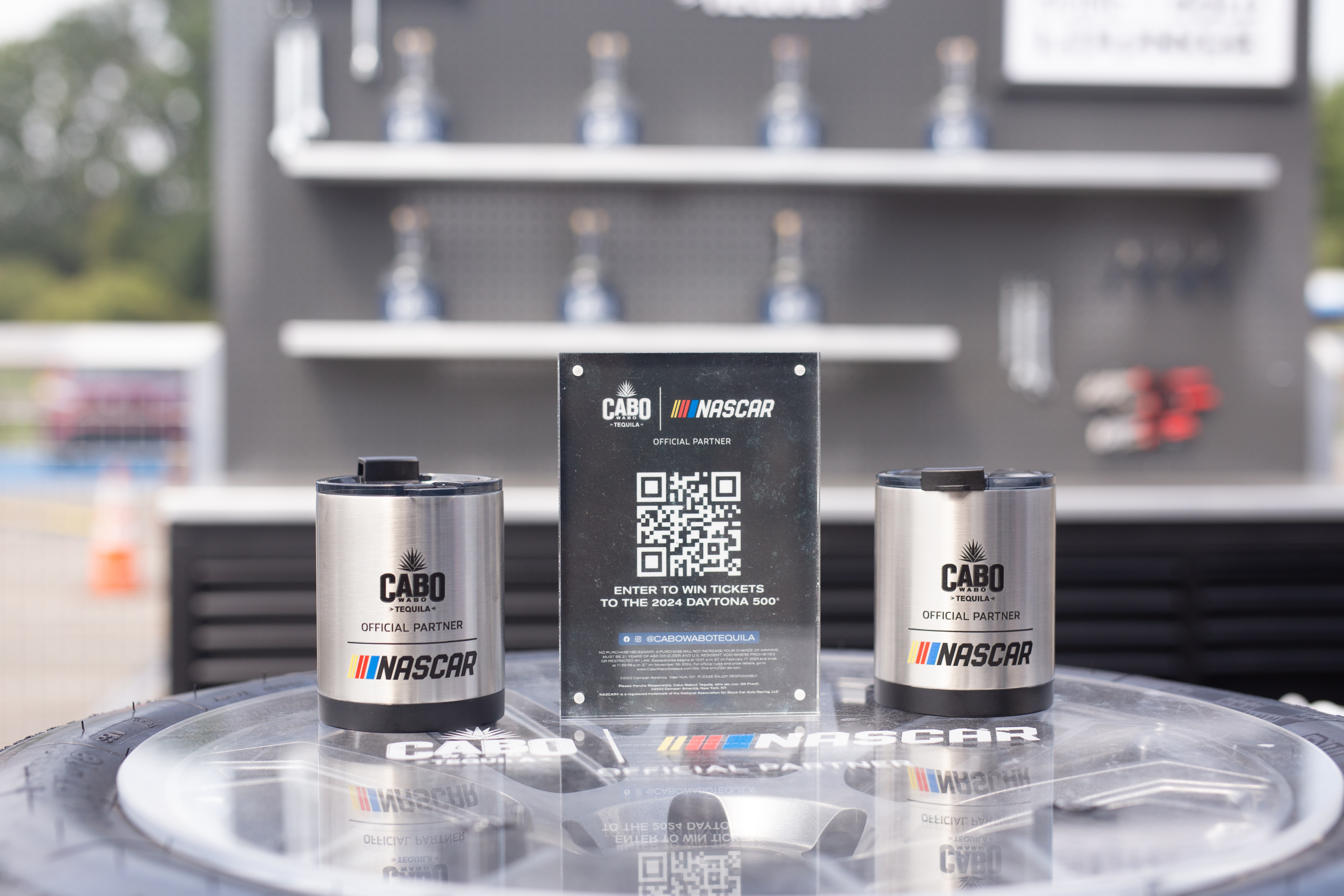
As an alcoholic beverage brand at a driving-focused event, it was important to us and our client to include strong responsible drinking messaging and programing. The front left wall of our space is home to our Refuel Station (below). A fridge with empty Cabo x NASCAR branded stainless steel water bottles sits next to a custom water spicket built into a mechanic tool cabinent. Signage encourages guests to have a plan and ‘make the pit stop’ by hydrating on race day and drinking responsibly.


2023 Experiential tour designed and managed by 160over90
Creative Director: Matt Tornetto
Art Director: Bridget Halliday (myself), Katie Copeland
Copywriters: John Berube, Madeline Houston
Production Managers: Mandy Heumann, Jill Stelzer
Production Artists: Amy Luna, Keith Miller
Strategist: Chryssi Yip
Account Executives: Maureen Chave, Lia Poin
Project Managers: Nicole Hagemann, Katie Hogan
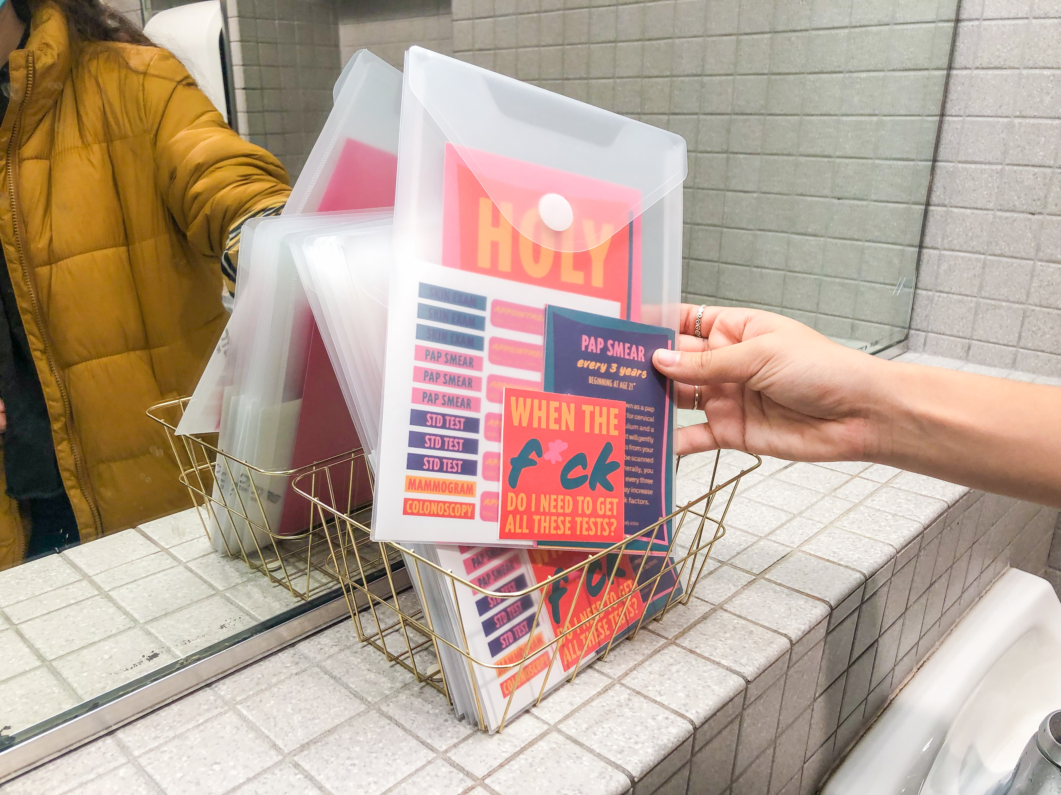
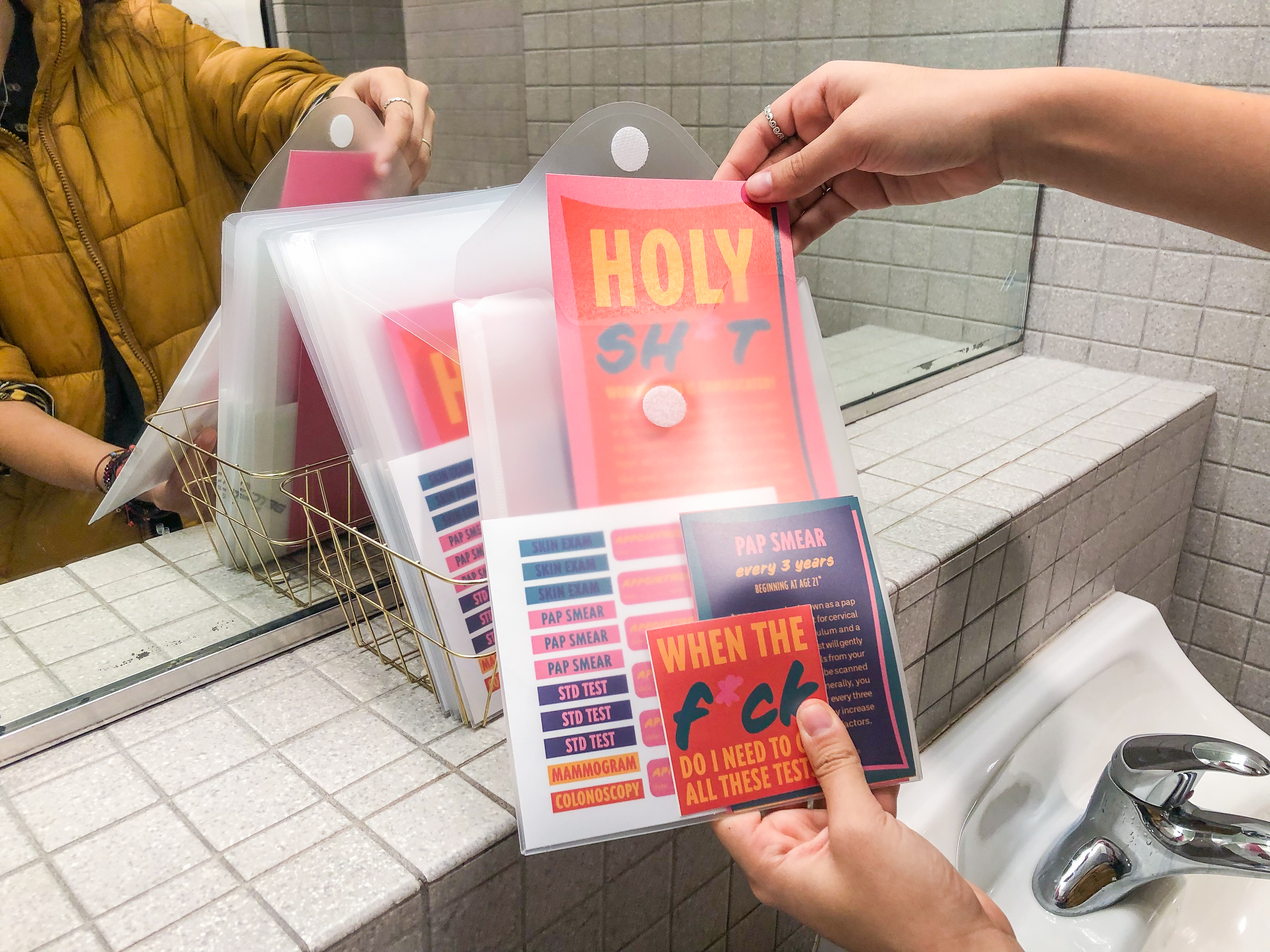
Women’s Health Info Kit
Information Design, Identityfall 2021
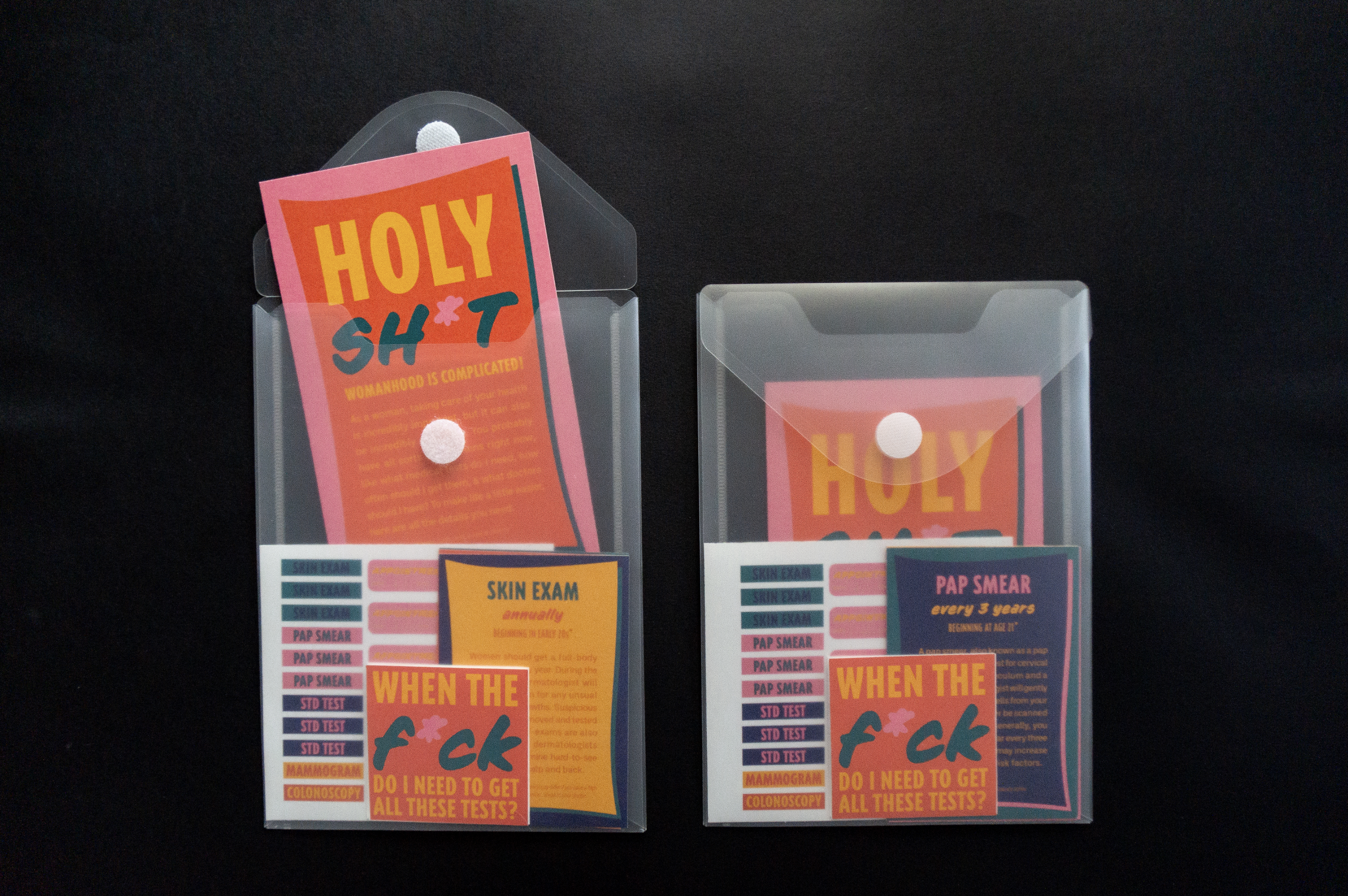
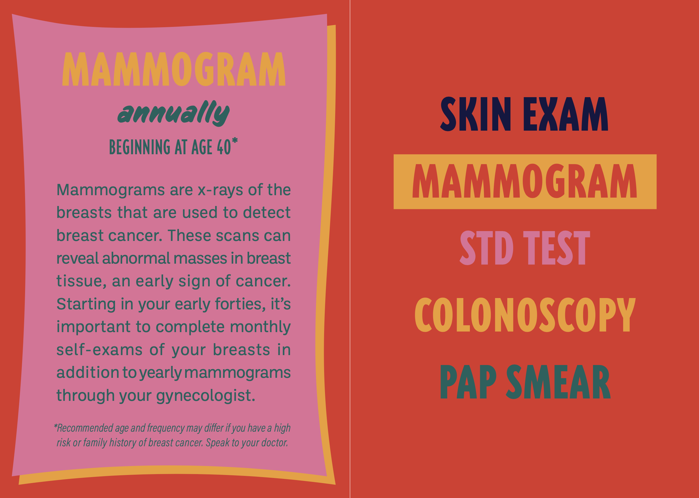
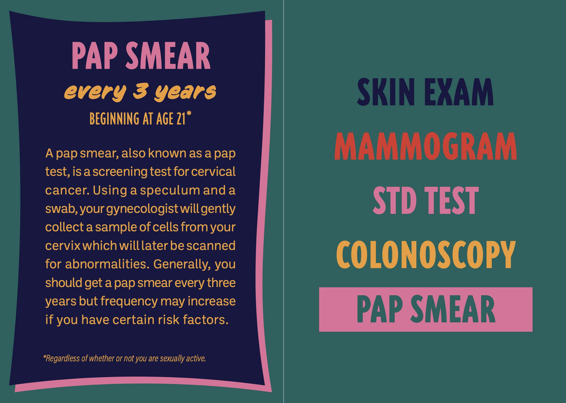
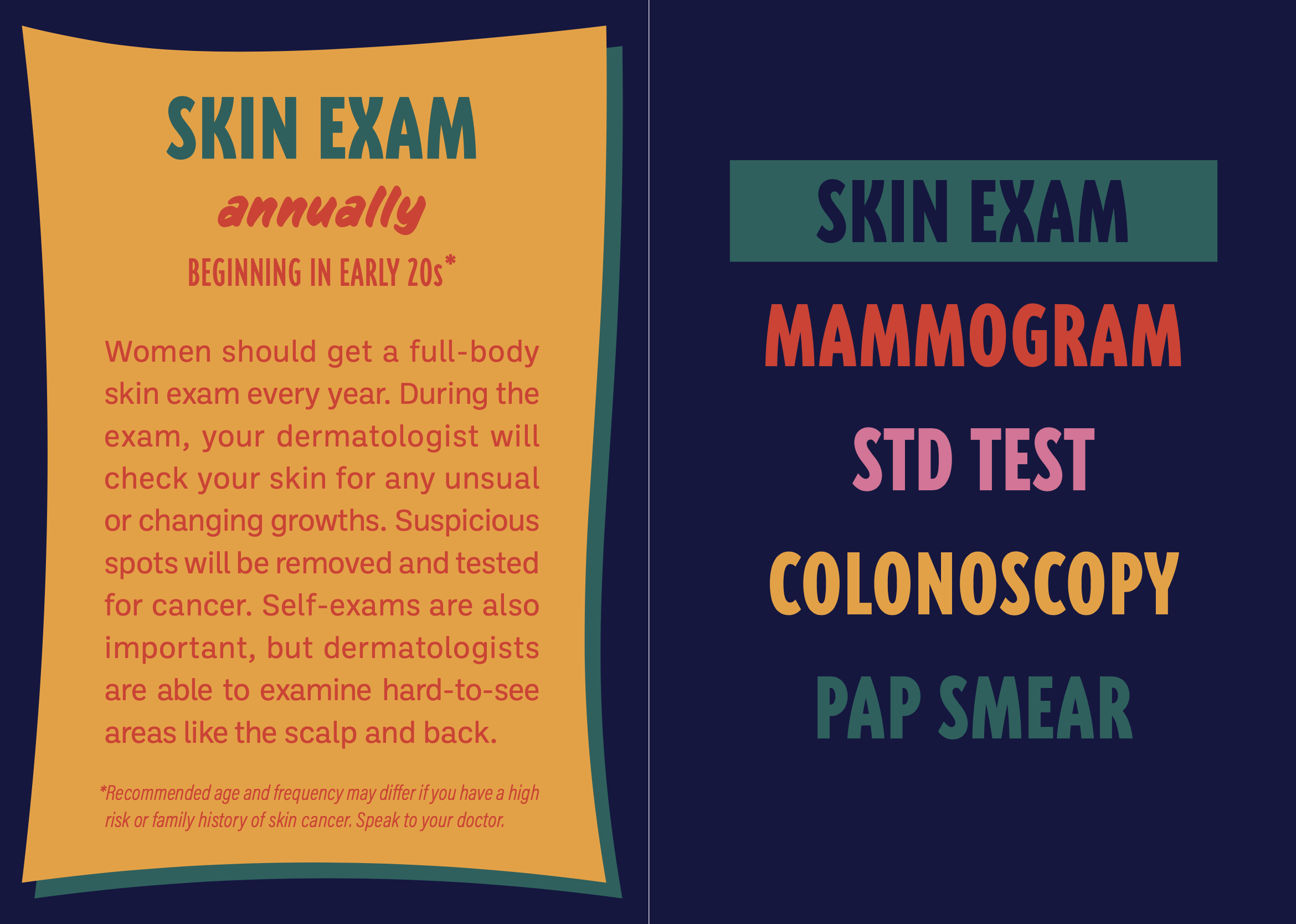
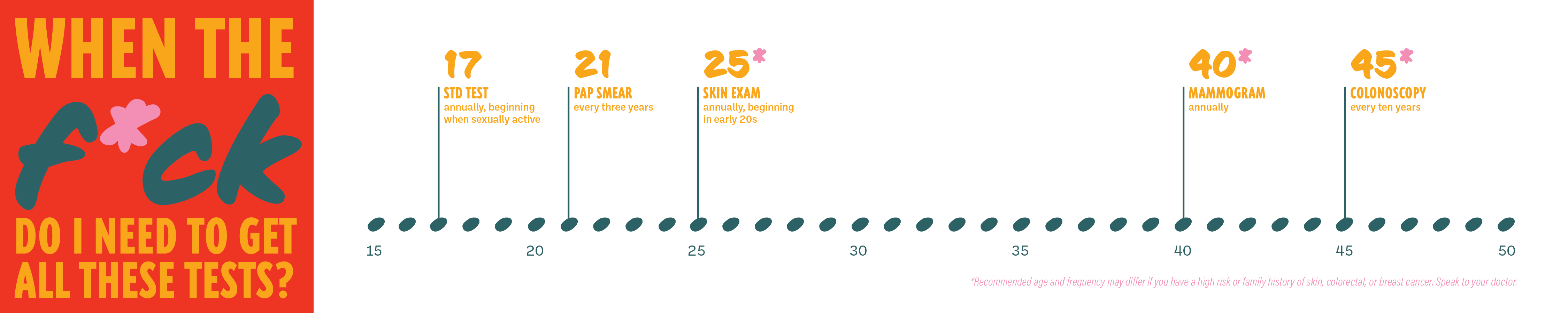
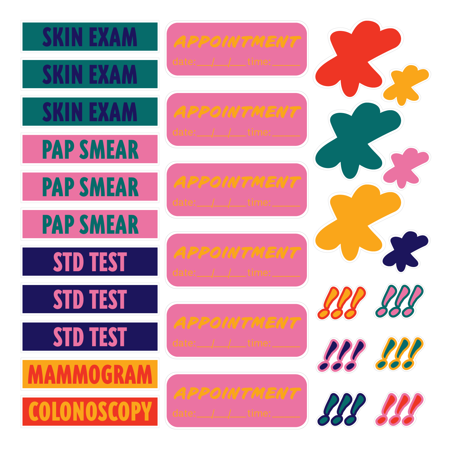
As a young woman myself, I’ve found it difficult to navigate healthcare services on my own for the first time. This anxiety is a common experience that my kit aims to ease by providing clear, digestible information for women who are beginning their healthcare journies on their own. The kit includes a card that acts as an introduction of the kit, 5 informational cards, a timeline, and a sticket sheet. The 5 cards highlight the main tests that women need to get in their lifetime, providing details about what the test is, at what age to get them, and how often to get tested. The timeline lays out the tests in a clear, linear manner. The stickers are to highlight certain tests, important dates, and appointments in the user’s calendar.
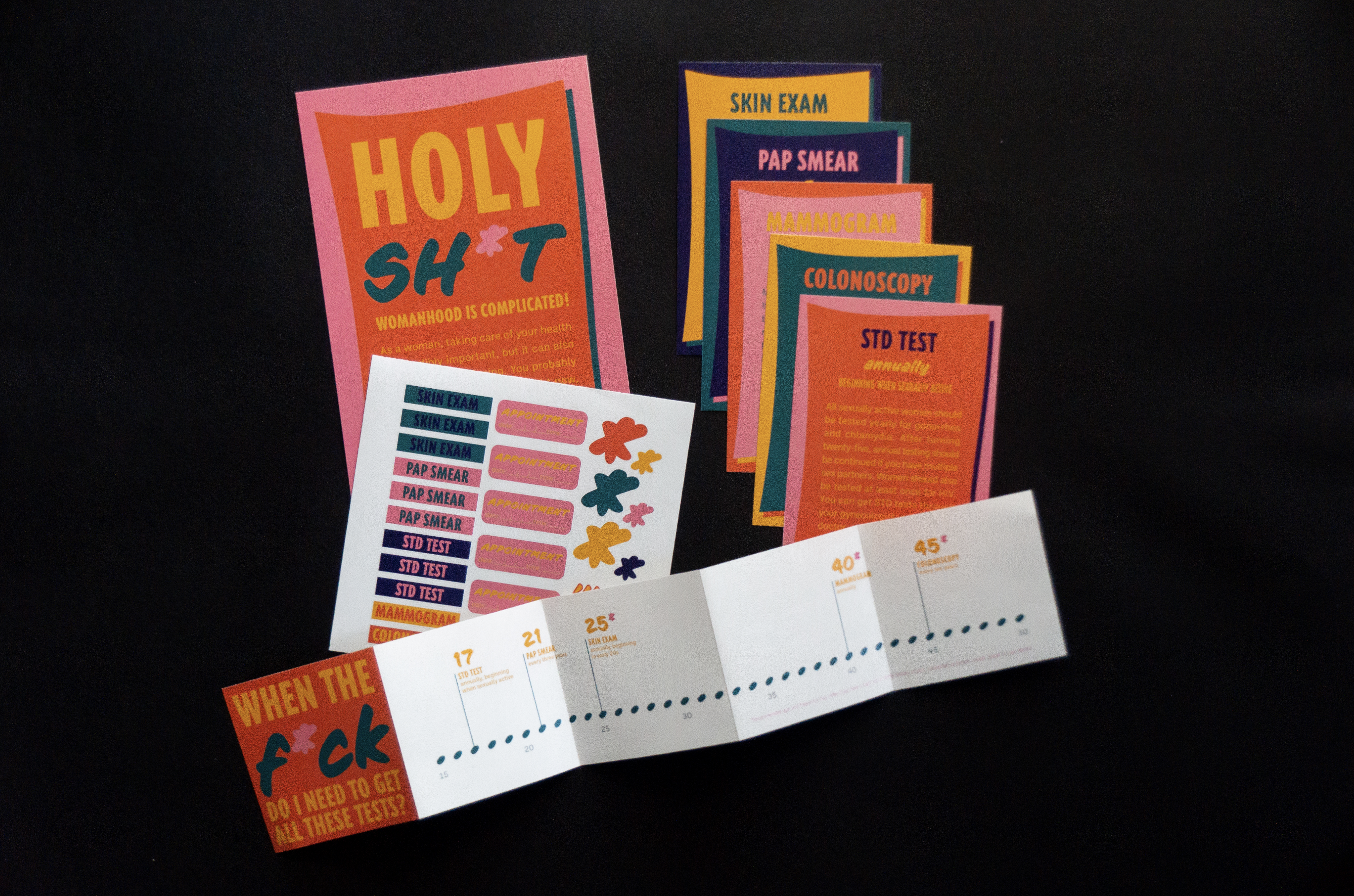
The finished kits were placed in a women’s bathroom on my university’s campus. I chose a bathroom in the main library since this bathroom sees a lot of foot traffic from primarily underclassmen. Because the kit targets women who are “just starting out,” a women’s bathroom at a university was the perfect location to easily reach this demographic.